7 Tidy your CSS with Sass
One of the main problem with CSS is to handle the growing number of files and the code repetition. Nowadays, web developers mainly use CSS pre-processors like Sass, which stands for “Syntactically Awesome Style Sheets,” providing access to variables, mathematical operators, functions and loops, thereby reducing the code complexity and extending the possibilities. RStudio developed the {sass} package (Cheng, Mastny, et al. 2021), which makes it possible to use Sass in Shiny apps or Rmarkdown documents.
7.1 Getting started with Sass
While we could use Sass from the terminal, we leverage the sass package features to work from R. To install sass, we run:
# CRAN
install.packages("sass")
# development version
remotes::install_github("rstudio/sass")
The main function is sass(), whose input parameter accepts:
- A R string like
a { color: pink}. - A named
list(). - A file passed with
sass_file(); imports withsass_import(). - More complex structures.
library(sass)
# with a string
sass(input = ".element-class { color: pink;}")
# with named list
sass(list(color = "pink", ".element-class { color: $color;}"))
#> /* CSS */
#> .element-class {
#> color: pink;
#> }Note how the R code objects are seamlessly converted to Sass variables. For convenience, we will be using named lists in the remainder of the book.
7.1.1 Variables
Let us consider the following example, where two different classes have the same color:
.class-1{
  color: #33BEFF;
}

.class-2{
  background-color: #33BEFF;
}
Shouldn’t this be easier? Imagine if we had hundreds of elements with the same color. What happens in case the color changes? Do we have to update all properties by hand?
If we let the Sass variable $color:
$color: purple;
.class-1{
  color: $color;
}
.class-2{
  background-color: $color;
}
we can quickly solve that problem. With sass, we define one variable holding the color as well as our two rules, so that we obtain:
rule1 <- ".class-1{ color: $color; }"
rule2 <- ".class-2{ background-color: $color; }"
sass(input = list(color = "purple", rule1, rule2))
#> /* CSS */
#> .class-1 {
#> color: purple;
#> }
#>
#> .class-2 {
#> background-color: purple;
#> }Add the default! tag after the variable definition, if you want
to let others modify it, that is "$color: purple !default;".
7.1.2 Partials and Modules
It is best practice to save useful code snippets in one place, and reuse them anytime and anywhere. Sass allows to define partials, like _partial.css, with the leading
underscore, which avoids its conversion into CSS. Partials are subsequently called
with @import <PARTIAL_NAME> (you may also find @use, the latter not being handled
by LibSass, which fuelssass), thereby significantly reducing code duplication.
Modules are pieces of Sass files that are later converted into CSS, reducing file size to a minimum.
Below is an example of the bootstrap.scss file:
/*!
 * Bootstrap v5.0.0-beta1 (https://getbootstrap.com/)
 ...
*/

// scss-docs-start import-stack
// Configuration
@import "functions";
@import "variables";
@import "mixins";
@import "utilities";

// Layout & components
@import "root";
@import "reboot";
...

// Helpers
@import "helpers";

// Utilities
@import "utilities/api";
// scss-docs-end import-stack
which is easier to read and maintain than the original bootstrap.css with 10717 lines of code!
In practice, we often end up with a main Sass file and compile it as follows:
7.1.3 Mixins and Functions
Another great advantage of Sass is the ability to generate reusable units of code, also known as mixins or functions.
7.1.3.1 Mixins
To make a 90-degree rotation in CSS, we have to write:
.element {
  -webkit-transform: rotate(90deg);
  -ms-transform: rotate(90deg);
  transform: rotate(90deg);
}
which is already tedious. Mixins allow us to encapsulate the logic into a reusable unit:
@mixin transform($property, ...) {
  -webkit-transform: $property;
  -ms-transform: $property;
  transform: $property;
}

.element1 {
  @include transform(rotate(90deg));
}
The mixin starts with a @mixin keyword followed by its name and parameters.
It is called with @include <MIXIN_NAME(PARMS)>, very similar to a function declaration, except that
it must return a CSS rule.
mixin <- "@mixin transform($property) {
  -webkit-transform: $property;
  -ms-transform: $property;
  transform: $property;
}"
rule <- ".element1 { @include transform($prop); }"
sass(input = list(prop = "rotate(90deg)", mixin, rule))
#> /* CSS */
#> .element1 {
#> -webkit-transform: rotate(90deg);
#> -ms-transform: rotate(90deg);
#> transform: rotate(90deg);
#> }7.1.3.2 Functions
Sass offers many built-in modules containing
ready-to-use functions for colors, numbers, strings, lists, maps, … Some functions like
rgb are global, so that we don’t have to import the corresponding module.
sass(".pouet { color: rgb(0, 255, 0); }")#> /* CSS */
#> .pouet {
#> color: lime;
#> }Besides, it is also possible to design custom functions with @function, the syntax being similar to that of the mixins:
@function name($parm1, $parm2) {
  /* logic */
  @return value;
}
While debugging functions, it might be useful to capture intermediate elements.
@debug allows this:
$test: 1;
@debug test;
sass(
  list(
    a = 2,
    b = 4,
    "@function multiply($parm1, $parm2) {
      @debug 'parm1 is #{$parm1}';
      @debug 'parm2 is #{$parm2}';

      @return $parm1 * $parm2;
    }",
    ".my-class {
      width: multiply($a, $b) * 1px;
    }"
  )
)
#> /* CSS */
#> .my-class {
#> width: 8px;
#> }Notice the use of mathematical operators like *, +, -, / and %, which is not possible with CSS.
7.1.4 Extend/Inheritance
We consider two alerts with the color as the only difference. As we can’t capture multiple properties
inside one single Sass variable, we introduce the extend concept, which permits us to import
CSS properties inside multiple rules. We first define a generic alerts-common rule,
prefixed by the % symbol. It contains several rules and variables:
%alerts-common {
  position: relative;
  padding: $alert-padding-y $alert-padding-x;
  margin-bottom: $alert-margin-bottom;
}


.alert-red {
  @extend %alerts-common;
  color: red;
}

.alert-green {
  @extend %alerts-common;
  color: green;
}
Let’s translate this into R:
common <- "%alerts-common {
  position: relative;
  padding: $alert-padding-y $alert-padding-x;
  margin-bottom: $alert-margin-bottom;
}"
alert_red <- ".alert-red {
  @extend %alerts-common;
  color: red;
}
"
alert_green <- ".alert-green {
  @extend %alerts-common;
  color: green;
}
"
sass(input = list(
  "alert-padding-y" = "5px",
  "alert-padding-x" = "10px",
  "alert-margin-bottom" = "2px",
  common,
  alert_red,
  alert_green
))
#> /* CSS */
#> .alert-green, .alert-red {
#> position: relative;
#> padding: 5px 10px;
#> margin-bottom: 2px;
#> }
#>
#> .alert-red {
#> color: red;
#> }
#>
#> .alert-green {
#> color: green;
#> }This method avoids to overload elements with unnecessary classes such as .alert-common .alert-red ....
Yet, we could have programmatically generated the two alert
classes with a loop to avoid duplication.
7.1.5 Flow controls
These are elements aimed at fine-tuning mixins and functions behavior.
7.1.5.1 if and else
As in every programming language, if and else control the execution of a code block, depending
on some conditions.
Below, we only want to conditionally control a shadow property, depending on the alert color:
@mixin add-shadow($color) {
  @if $color == red {
    box-shadow:
      0 4px 10px 0 rgb(255, 0, 0),
      0 4px 20px 0 rgb(255, 0, 0);
  } @else if $color == green {
    box-shadow:
      0 4px 10px 0 rgb(0, 255, 0),
      0 4px 20px 0 rgb(0, 255, 0);
  }
}

.alert-red {
  @extend %alerts-common;
  color: red;
  @include add-shadow($color: red);
}

.alert-green {
  @extend %alerts-common;
  color: green;
  @include add-shadow($color: green);
}
add_shadow <- "@mixin add-shadow($color) {
  @if $color == red {
    box-shadow:
      0 4px 10px 0 rgb(255, 0, 0),
      0 4px 20px 0 rgb(255, 0, 0);
  } @else if $color == green {
    box-shadow:
      0 4px 10px 0 rgb(0, 255, 0),
      0 4px 20px 0 rgb(0, 255, 0);
  }
}
"

common <- "%alerts-common {
  position: relative;
  padding: $alert-padding-y $alert-padding-x;
  margin-bottom: $alert-margin-bottom;
}"

alert_red <- ".alert-red {
  @extend %alerts-common;
  color: red;
  @include add-shadow($color: red);
}
"

alert_green <- ".alert-green {
  @extend %alerts-common;
  color: green;
  @include add-shadow($color: green);
}
"
sass(input = list(
  "alert-padding-y" = "5px",
  "alert-padding-x" = "10px",
  "alert-margin-bottom" = "2px",
  common,
  add_shadow,
  alert_red,
  alert_green
))
#> /* CSS */
#> .alert-green, .alert-red {
#> position: relative;
#> padding: 5px 10px;
#> margin-bottom: 2px;
#> }
#>
#> .alert-red {
#> color: red;
#> box-shadow: 0 4px 10px 0 red, 0 4px 20px 0 red;
#> }
#>
#> .alert-green {
#> color: green;
#> box-shadow: 0 4px 10px 0 lime, 0 4px 20px 0 lime;
#> }7.1.5.2 Loops
7.1.5.2.1 Each
We would like to create the alert class with only one rule. We first define a list of colors in Sass and
call @each:
$colors: red, green;

@each $color in $colors {
  .alert-#{$color} {
    color: green;
    @include add-shadow($box-color: $color);
  }
}
The structure is the same as the JavaScript loop. You’ll also notice the #{...}, which
is called interpolation and allows us to
insert any Sass expression in a string. As another example, if we want to create a background-image property
within a mixin, we could do background-image: url("/some_path/#{$name}.svg"), where #{$name} holds the file name.
add_shadow <- "@mixin add-shadow($color) {
  @if $color == red {
    box-shadow:
      0 4px 10px 0 rgb(255, 0, 0),
      0 4px 20px 0 rgb(255, 0, 0);
  } @else if $color == green {
    box-shadow:
      0 4px 10px 0 rgb(0, 255, 0),
      0 4px 20px 0 rgb(0, 255, 0);
  }
}
"

common <- "%alerts-common {
  position: relative;
  padding: $alert-padding-y $alert-padding-x;
  margin-bottom: $alert-margin-bottom;
}"

alerts_rule <- "@each $color in $colors {
  .alert-#{$color} {
    @extend %alerts-common;
    color: green;
    @include add-shadow($color: $color);
  }
}
"
sass(input = list(
  colors = c("green", "red"),
  "alert-padding-y" = "5px",
  "alert-padding-x" = "10px",
  "alert-margin-bottom" = "2px",
  common,
  add_shadow,
  alerts_rule
))
#> /* CSS */
#> .alert-red, .alert-green {
#> position: relative;
#> padding: 5px 10px;
#> margin-bottom: 2px;
#> }
#>
#> .alert-green {
#> color: green;
#> box-shadow: 0 4px 10px 0 lime, 0 4px 20px 0 lime;
#> }
#>
#> .alert-red {
#> color: green;
#> box-shadow: 0 4px 10px 0 red, 0 4px 20px 0 red;
#> }It becomes even more powerful while working with maps like $font-weights: ("regular": 400, "medium": 500, "bold": 700);, i.e, by key/value pairs.
@each is as convenient as lapply or map functions to chain repetitive rules creation.
7.1.5.2.2 For
However, it is not straightforward to count up or down with @each. This is precisely where
@for fills the gap. The generic scheme is:
@for <variable> from <expression> to <expression> { ... }
@for <variable> from <expression> through <expression> { ... }
to excludes the last number while through includes it.
7.1.6 Nesting code
To make your code more readable, Sass allows you to nest rules by hierarchy, thereby aligning with the underlying HTML structure. For instance, looking at the previous example from section 6.2.4.3.3:
.navbar-nav > li:first-child > a {
  font-size: 20px;
  font-weight: bold;
}
.navbar-nav > li:first-child > a::before {
  content: '✌️'
}
Transforming to Sass code, we combine the two previous rules into a single one:
.navbar-nav {
  > li:first-child {
    > a {
      font-size: 20px;
      font-weight: bold;

      &:before {
        content: '✌️'
      }
    }
  }
}
The following is another example taken from the AdminLTE3 library powering bs4Dash. This code shows how the card CSS is structured, leveraging all the above Sass capabilities like mixins, nesting, functions, … This chunk may be read from top to bottom and gives a rather good idea of how the card will look, contrary to the classic CSS approach. It first applies a shadow with a mixin, then sets the bottom margin with a function. All listed variables are defined in a separate file. Besides, the card body has text printed in white color when the dark mode is active. Finally, when the card is collapsed, none of the body and footer elements are displayed.
.card {
  @include box-shadow($card-shadow);
  margin-bottom: map-get($spacers, 3);

  &.bg-dark {
    .card-header {
      border-color: $card-dark-border-color;
    }

    &,
    .card-body {
      color: $white;
    }
  }
  /* other rules */
  // collapsed mode
  &.collapsed-card {
    .card-body,
    .card-footer {
      display: none;
    }
  }
  /* other rules */
}
7.2 {sass} best practices
As it’s best practice, especially for debugging purposes, to include assets as HTML
dependencies, it is a good idea to organize the Sass variable definition, the function/mixins in layers, leveraging the sass_layer() function:
rule1 <- ".class-1{ color: $color; }"
rule2 <- ".class-2{ background-color: $color; }"
layer1 <- sass_layer(
  defaults = list(color = "purple"),
  rules = list(rule1, rule2)
)
#> /* Sass Bundle */
#> $color: purple;
#> .class-1{ color: $color; }
#> .class-2{ background-color: $color; }
#> /* *** */Besides, sass_layer() provides options like:
-
declarations containing any function, mixin elements, in a
sass_filefor instance. - html_deps that attaches a single or a list of HTML dependencies to the provided Sass code, as shown below.
sass_layer(
  html_deps = htmltools::htmlDependency(
    name = "my-dep",
    version = "1.0.0",
    package = "mypkg",
    src = "path",
    ...
  )
)
Ultimately, multiple layers may be bundled with sass_bundle():
layer2 <- sass_layer(
  defaults = list(color = "blue"),
  rules = list(rule1, rule2)
)


my_bundle <- sass_bundle(layer1 = layer1, layer2 = layer2)
my_bundle
#> /* Sass Bundle: layer1, layer2 */
#> $color: blue;
#> $color: purple;
#> .class-1{ color: $color; }
#> .class-2{ background-color: $color; }
#> .class-1{ color: $color; }
#> .class-2{ background-color: $color; }
#> /* *** */#> /* CSS */
#> .class-1 {
#> color: purple;
#> }
#>
#> .class-2 {
#> background-color: purple;
#> }
#>
#> .class-1 {
#> color: purple;
#> }
#>
#> .class-2 {
#> background-color: purple;
#> }sass_bundle_remove() removes a given layer from the bundle, provided that you passed a named list to sass_bundle().
This allows other developers to reuse and modify predefined layers:
my_bundle <- sass_bundle_remove(my_bundle, "layer2")
my_bundle
#> /* Sass Bundle: layer1 */
#> $color: purple;
#> .class-1{ color: $color; }
#> .class-2{ background-color: $color; }
#> /* *** */
sass(my_bundle)#> <style>.class-1 {
#> color: purple;
#> }
#>
#> .class-2 {
#> background-color: purple;
#> }
#> </style>#> /* CSS */
#> .class-1 {
#> color: purple;
#> }
#>
#> .class-2 {
#> background-color: purple;
#> }7.3 From Sass to CSS
sass() can generate CSS from Sass by passing an output parameter pointing to the path where
to generate the CSS file. Best practice consists in enabling compression and source maps. We discuss
this later in the book in Chapter 21. Overall those steps makes the code faster to load and easier to debug:
sass(
  list(
   color = "pink",
   ".a { color: $color; }"
  ),
  options = sass_options(
    output_style = "compressed",
    source_map_embed = TRUE
  )
)
/* CSS */
.a{color:pink}
/*# sourceMappingURL=data:application/json;base64,ewoJInZlcn
Npb24iOiAzLAoJImZpbGUiOiAic3RkaW4uY3NzIiwKCSJzb3VyY2VzIjogWwo
JCSJzdGRpbiIKCV0sCgkibmFtZXMiOiBbXSwKCSJtYXBwaW5ncyI6ICJBQUNB
LEFBQUEsRUFBRSxBQUFDLENBQUUsS0FBSyxDQURGLElBQUksQ0FDVSIK
fQ== */
sass(
  sass_file("main.scss"),
  "<OUTPUT PATH>",
  options = sass_options(
    output_style = "compressed",
    source_map_embed = TRUE
  )
)
7.4 Caching
By default, sass() will try to do the minimum work, that is, on the first compilation, the resulting code is cached so that further compilation is not required. However, this behavior can lead to issues during development, especially for previewing a new theme change, since by definition, sass() will go directly in the cache instead of picking up the new elements. This is also what happens in a web browser when CSS is cached, preventing seeing any style change unless the cache is emptied. To avoid this, we encourage developers to set options(sass.cache=FALSE) during the theme development phase.
7.5 Sass and Shiny
Now let’s go back to Shiny! How do we include Sass code in a Shiny app? There are multiple situations:
- You simply want to style a Shiny app.
- You developed a template with custom JS and Sass/CSS to be reused by other developers.
The first option is rather simple since the Sass code is compiled with sass() before the Shiny app is launched. The resulting code may be either a string or a CSS file (within the www folder), to be included in the head. We assume it is located at the app folder level:
sass(
  list(
    color = "pink",
    size = "30px",
    ".awesome-link {
      color: $color;
      font-size: $size;
      &:hover{
        color: green;
      }
    }"
  ),
  output = "www/main.min.css",
  options = sass_options(
    output_style = "compressed",
    source_map_embed = TRUE
  )
)
Source maps allow us to see the original Sass code, as shown Figure 7.1.
sass_options() gives the flexibility to fine-tune the CSS output and source map configuration.
For complex projects where the CSS compilation may take time, we strongly advise processing the CSS independently from the app startup.
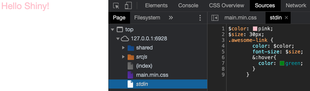
FIGURE 7.1: Inspect Sass code in the web browser.
The second option requires running sass() passing an output file within the package. Then, the generated CSS
is included in an HTML dependency, ready to be shipped with the template:
sass(
  sass_file("main.scss"),
  "<OUTPUT PATH>/main.css",
  options = sass_options(
    output_style = "compressed",
    source_map_embed = TRUE
  )
)

my_css_deps <- htmltools::htmlDependency(
  name = "my-style",
  version = "1.0.0",
  package = "mypkg",
  src = "<OUTPUT PATH>",
  stylesheet = "main.css"
)
7.6 Examples
7.6.1 Customize {bs4Dash} colors
bs4Dash is a Bootstrap 4 dashboard template built on top of the AdminLTE3 HTML template. shinydashboard is powered by the previous version, that is AdminLTE2, which makes it somehow bs4Dash’s big brother!
AdminLTE3 relies on Sass, and all files are stored here. Particularly, all variables are located in the _variables.scss partial. Since we can decompose our
Sass code in multiple layers, we seamlessly customize the theme color
variables listed below:
$blue: #0073b7 !default;
$lightblue: #3c8dbc !default;
$navy: #001f3f !default;
$teal: #39cccc !default;
$olive: #3d9970 !default;
$lime: #01ff70 !default;
$orange: #ff851b !default;
$fuchsia: #f012be !default;
$purple: #605ca8 !default;
$maroon: #d81b60 !default;
$black: #111 !default;
$gray-x-light: #d2d6de !default;
Let’s provide our own defaults with some custom colors:
$blue: #136377 !default;
$olive: #d8bc66 !default;
$lime: #fcec0c !default;
$orange: #978d01 !default;
$maroon: #58482c !default;
$gray-x-light: #d1c5c0 !default;
Now we would have to recompile the whole AdminLTE3 Sass code to account for these changes.
It means all scss assets must be accessible somewhere: this is what the fresh package is doing under the hood.
No worries, we’ll come back to fresh in the next chapter. For now, we rely on the {OSUICode} Sass code stored at
system.file("sass/adminlte/adminlte.scss", package = "OSUICode") (since fresh may change in the future, {OSUICode} will be frozen to make sure the code always works):
css <- sass(
  sass_layer(
    defaults = list(
      lightblue = "#136377",
      olive = "#d8bc66",
      lime = "#fcec0c",
      orange = "#978d01",
      maroon = "#58482c",
      "gray-x-light" = "#d1c5c0"
    ),
    rules = sass_file(
      input = system.file(
        "sass/adminlte/adminlte.scss",
        package = "OSUICode"
      )
    )
  )
)
# This CSS is injected inside the app head (see example)
The corresponding app may be tested below. If you want to see the whole code, run OSUICode::get_example("sass/examples/bs4Dash-custom").
### RUN ###
# OSUICode::run_example(
#  "sass/examples/bs4Dash-custom",
#   package = "OSUICode"
# )
Output is shown in Figure 7.2.
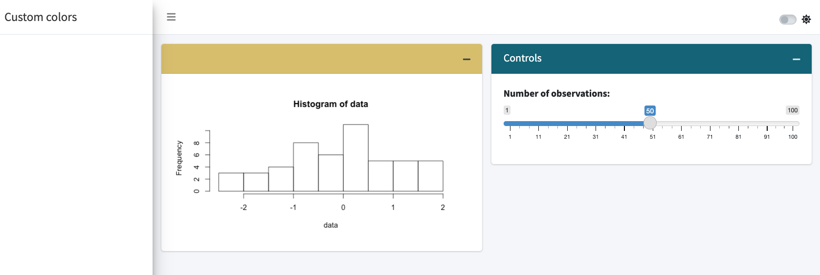
FIGURE 7.2: Custom AdminLTE colors.
You probably noticed a potential issue. We indeed have to rely on a specific AdminLTE version,
namely 3.1.0, that is not necessarily the one we want. Therefore, an alternative would
be to download the Sass files from AdminLTE3, store them in a package, ideally the /inst folder, and recompile the code from that folder with new variables. As AdminLTE3 depends on Bootstrap 4, we would have to recover those dependencies in a separate folder, making sure it is accessible to the AdminLTE Sass code.
7.6.2 Customize {shinybulma}
For convenience, the Sass code is already included in the book side package. The goal is to change the main color palette that comprises:
- primary
- info
- success
- warning
- danger
In total, bulma exposes 419 Sass variables!
Among all files, we locate the main variables file and select the relevant variables we want to modify. Notice we can retrieve all the information on initial variables and derived variables.
We assign them new values:
$turquoise: #03a4ff;
$cyan: #e705be;
$green: #f3d6e9;
$yellow: #fdaf2c;
$red: #ff483e;
$scheme-main: hsl(0, 0%, 4%);
Particularly, we target the main body color stored in $scheme-main. Instead of pointing
to $white, we change its value to the default $black. We then Compile the new CSS with sass():
css <- sass(
  sass_layer(
    defaults = list(
      turquoise = "#03a4ff",
            cyan = "#e705be",
            green = "#f3d6e9",
            yellow = "#fdaf2c",
            red = "#ff483e",
      "scheme-main" = "hsl(0, 0%, 10%)"
    ),
    rules = sass_file(input = system.file(
      "sass/bulma/bulma.sass",
      package = "OSUICode"
    ))
  )
)
Finally, we try the new theme in the following app, shown in Figure 7.3.
If you want to see the whole code, run OSUICode::get_example("sass/examples/shinybulma-custom").
### RUN ###
# OSUICode::run_example(
#  "sass/examples/shinybulma-custom",
#   package = "OSUICode"
# ) 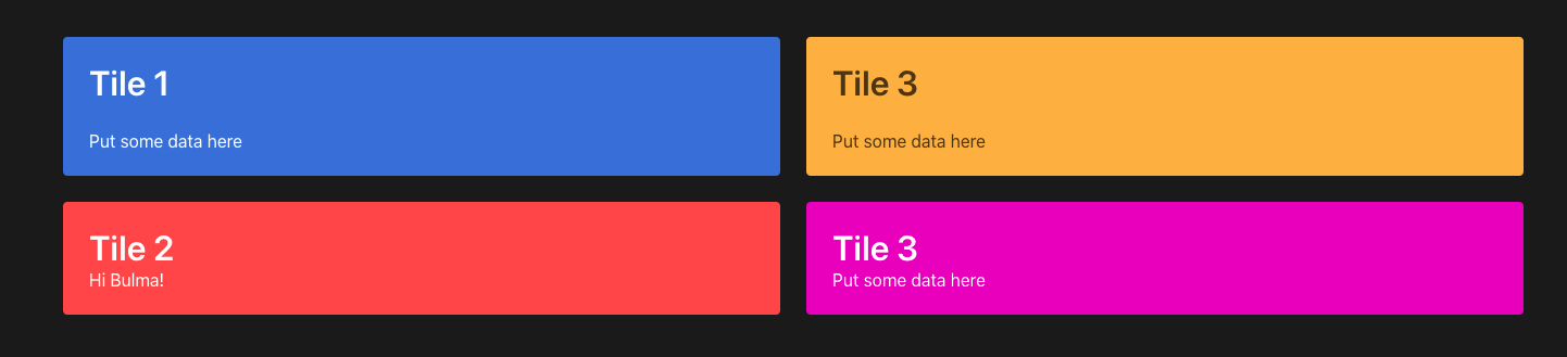
FIGURE 7.3: Custom bulma theme.