9 Become a theming wizard with {bslib}
{bslib} (Sievert and Cheng 2021) is a package developed by RStudio, built on top sass providing weapons to deeply customize your apps, in a ridiculously short amount of time and without too much pain, as shown in Figure 9.1.
FIGURE 9.1: Shiny app with NES css custom theme.
At the time of writing, bslib does not support shinydashboard and bs4Dash. bslib requires {shiny} >= 1.6.0. Bootstrap 5 support requires {shiny} >= 1.6.0.9001 and {bslib} >= 0.3.0. {bslib} > 0.3.0 defaults to Bootstrap 5.
To install bslib, we run:
# CRAN
install.packages("bslib")
# development version
remotes::install_github("rstudio/bslib")
The following code will allow you to quickly customize the theme from Figure 9.1 and get a better idea of {bslibs}’s power. Let’s meet in the next section to understand what magic is behind it.
9.1 High-level customization
Like fresh, bslib offers a high-level set of functions allowing users to quickly customize Shiny apps. For many users, this step will be enough.
9.1.1 Create a theme
bs_theme() seamlessly modifies the main CSS properties like:
- The background color, namely
bg. - The foreground color, namely
fg. - Change default theme colors, also called accents.
- Modify the font. This leverages the
font_google(),font_face()andfont_link()functions. In practice,font_google()caches the font resources so that they are always available to the user.
Additionally, it gives the flexibility to choose Bootstrap version, falling back to version_default() if not specified. Currently, the version is 4 but will change in the future, which is why it is advised to specify a value to avoid any unexpected breaking change. This function has three flavors:
-
Bootstrap 3, with
"3"(see Chapter 3, Shiny primarily relies on Bootstrap 3). -
Bootstrap 4 + compatibility with Bootstrap 3, with
"4". -
Bootstrap 5 with
"5". - More Bootstrap versions
Advanced users appreciate a ... slot to add extra variables through bs_add_variables(), with literally hundreds of choices. We give more details in section 9.2. In the following, we decide to default to Bootstrap 4.
library(bslib)

bs_theme(
  version = version_default(),
  bootswatch = NULL,
  ...,
  bg = NULL,
  fg = NULL,
  primary = NULL,
  secondary = NULL,
  success = NULL,
  info = NULL,
  warning = NULL,
  danger = NULL,
  base_font = NULL,
  code_font = NULL,
  heading_font = NULL
)
Let’s create a very simple theme:
simple_bs4_theme <- bs_theme(version = 4)We deliberately trimmed the corresponding output to get a better rendering in the book.
#> /* Sass Bundle: _root, _reboot, ..., _toasts, _modal, ... */
#>
#> /* MORE Sass imports ... */
#> @import "../scss/_toasts.scss";
#> @import "../scss/_modal.scss";
#>
#> /* MORE Sass imports ... */
#>
#> /* *** */
#> Other Sass Bundle information:
#> List of 2
#>  $ html_deps       :List of 1
#>   ..$ :List of 10
#>   .. ..$ name      : chr "bs3compat"
#>   .. ..$ version   : chr "0.2.5.9002"
#>   .. ..$ src       :List of 1
#>   .. .. ..$ file: chr "bs3compat/js"
#>   .. ..$ meta      : NULL
#>   .. ..$ script    : chr [1:3] "transition.js" "tabs.js"
#>   "bs3compat.js"
#>   .. ..$ stylesheet: NULL
#>   .. ..$ head      : NULL
#>   .. ..$ attachment: NULL
#>   .. ..$ package   : chr "bslib"
#>   .. ..$ all_files : logi TRUE
#>   .. ..- attr(*, "class")= chr "html_dependency"
#>  $ file_attachments: Named chr "..."
#>   ..- attr(*, "names")= chr "fonts"
At a glance, the output contains a bundle with Sass code for all Bootstrap 4 components (toasts, modals, …). Then, each of those modules are imported with the @import statement. The remaining consists of an HTML dependency providing compatibility with Bootstrap 3 and fonts assets.
9.1.2 Update a theme
bslib exposes handy functions to alter the theme Sass code, that is, remove (bs_remove()) or add (bs_theme_update()) rules to/from a preexisting theme. This may be useful to reduce the code size or add missing rules on the fly. For instance, if we don’t need to alter the toast component, there is no need to include its Sass code in the theme. We therefore do:
simple_bs4_theme <- bs_remove(simple_bs4_theme, "_toasts")Inversely, if we missed a CSS rule, we may leverage bs_theme_update(), which is able to update a given theme object, generated with bs_theme(). Below, we change the default primary color () to a lighter blue:
simple_bs4_theme <- bs_theme_update(
  simple_bs4_theme,
  primary = htmltools::parseCssColors("lightblue")
)
Note the use of htmltools::parseCssColors(), which converts a color name to the corresponding HEX code:
htmltools::parseCssColors("blue")#> [1] "#0000FF"
htmltools::parseCssColors("gainsboro")#> [1] "#DCDCDC"9.1.3 Preview a theme
We first create a custom neon theme:
bslib_neon_theme <- bs_theme(
  version = 4,
  bg = "#000000",
  fg = "#FFFFFF",
  primary = "#9600FF",
  secondary = "#1900A0",
  success = "#38FF12",
  info = "#00F5FB",
  warning = "#FFF100",
  danger = "#FF00E3",
  base_font = "Marker Felt",
  heading_font = "Marker Felt",
  code_font = "Chalkduster"
)
At any time, developers may preview the resulting theme with bs_theme_preview(), for instance:
### RUN ###
# OSUICode::run_example(
#  "bslib/theme-preview",
#   package = "OSUICode"
# )

### APP CODE ###
library(shiny)
library(bslib)
library(OSUICode)

bs_theme_preview(bslib_neon_theme, with_themer = FALSE)
Interestingly, bs_theme_preview() is no more than shiny::runApp() when the with_themer is FALSE.
This gives the result shown in Figure 9.2.
FIGURE 9.2: Theme preview in action.
9.1.4 Live theming
Let’s go even further! Wouldn’t it be cool to be able to modify the app at runtime with a plug and play widget? This is possible with bslib, owing to the run_with_themer() wrapper.
It takes a Shiny App object as input (i.e. defined with shiny::shinyApp()):
### RUN ###
# OSUICode::run_example(
#  "bslib/run-with-themer",
#   package = "OSUICode"
# )

### APP CODE ###
library(shiny)
library(bslib)
library(OSUICode)

ui <- fluidPage(
  theme = bslib_neon_theme,
  tabsetPanel(
    tabPanel(
      "First tab",
      "The contents of the first tab",
      actionButton("test", "Test")
    ),
    tabPanel(
      "Second tab",
      "The contents of the second tab"
    )
  )
)
server <- function(input, output, session) {}
run_with_themer(shinyApp(ui, server))
As depicted by Figure 9.3, the themer does not only show a live
theming widget. It also shows the corresponding code output step by step, so as to
update the original theme. Under the hood, it leverages the bs_theme_update() function, described above.
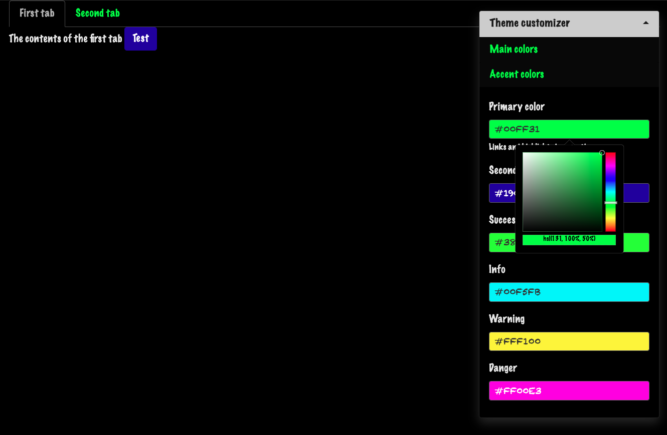
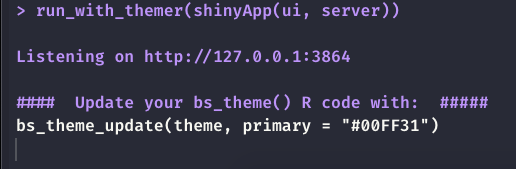
FIGURE 9.3: Live theming with bslib. Left: themer widget. Right: code output.
Alternatively, passing with_themer = TRUE inside bs_theme_preview does also the same thing.
For further details, we refer the reader to the official documentation.
Even though there exists a third function, namely bs_themer, I don’t encourage using it, as it has to be inserted in the server function, which can be easily forgotten by mistake.
9.2 Low-level customization
9.2.1 Add new variables
bs_add_variables() adds new variables at a specific position within a theme. By default, they are inserted before other Sass defaults. It is a lower-level function since you have to
know the corresponding Bootstrap variable(s). Let’s consider the example of a Bootstrap 4 badge where we aim at changing the font size, font weight and padding. The corresponding Sass code may be found here, and we identify a few variables, whose default values are shown in the Bootstrap 4 variables code here:
// Typography
//
// Font, line-height, and color for body text, headings, and more.
$font-weight-bold:        700 !default;

// Define common padding and border radius sizes and more.
$border-radius:           .25rem !default;

// Badges

$badge-font-size:         75% !default;
$badge-font-weight:       $font-weight-bold !default;
$badge-padding-y:         .25em !default;
$badge-padding-x:         .4em !default;
$badge-border-radius:     $border-radius !default;
Now we create our custom theme, increasing the font weight, size and changing the border radius to obtain rounded corners:
library(magrittr)

custom_badge_theme <- bs_theme(
  version = 4,
  # high level theming
  success = htmltools::parseCssColors("lightgreen")
) %>%
  bs_add_variables(
    # low level theming
    "badge-font-weight" = 900,
    "badge-font-size" = "100%",
    "badge-padding-y" = "0.5em",
    "badge-padding-x" = "0.8em",
    "badge-border-radius" = "1rem"
  )
It would be tempting to change the global $font-weight-bold, but it might affect
other elements. Let’s just overwrite the badge-font-weight.
The badge code is given by the following HTML:
<span class="badge badge-success">Success</span>We leverage our previous knowledge to convert it to R and make it browsable with htmltools:
library(htmltools)

my_badge <- a(class = "badge badge-success", "1")
preview_badge <- function(theme = NULL) {
  if (interactive()) {
    tag <- if (is.null(theme)) {
      # default bs4 theme
      bs_theme(version = 4)
    } else {
      # altered badge
      theme
    }
    browsable(
      tags$body(
        br(),
        bs_theme_dependencies(theme),
        my_badge
      )
    )
  }
}

# preview_badge(custom_badge_theme)
# preview_badge() # default badge
FIGURE 9.4: Custom Bootstrap 4 badge with bslib. Left: custom badge, right: default badge.
bs_theme_dependencies() is used outside of a Shiny context to include the theme Sass code as a dependency.
9.2.2 Import external rules
Let’s try with another example. We would like to bring a refreshment to the Bootstrap UI elements with one of the most modern UI kit to date, namely 98.css, a Windows 98 CSS kit. The CSS assets may be accessed from jsdelivr, as follows:
win98_cdn <- "https://cdn.jsdelivr.net/npm/98.css@0.1.16/"
win98_css <- paste0(win98_cdn, "dist/98.min.css")
bslib exposes neat tools to import extra CSS in the current theme, such as bs_add_rules(), which calls sass::sass_file() under the hood:
theme %>%
  bs_add_rules(
    sprintf('@import "%s"', win98_css)
  )
The three theme colors are #c0c0c0 for the background and all colors (except primary), #03158b for primary and #222222 for the text. We also disable the rounded option so that button borders stay squared.
windows_grey <- "#c0c0c0"
windows98_theme <- bs_theme(
  version = 4,
  bg = windows_grey,
  fg = "#222222",
  primary = "#03158b",
  base_font = c("Times", "Arial"),
  secondary = windows_grey,
  success = windows_grey,
  danger = windows_grey,
  info = windows_grey,
  light = windows_grey,
  dark = windows_grey,
  warning = windows_grey,
  "font-size-base" = "0.75rem",
  "enable-rounded" = FALSE
) %>%
  bs_add_rules(
    sprintf('@import "%s"', win98_css)
  )
To run the corresponding app you may call windows98_theme %>% bs_theme_preview() or copy and paste the
below code in your R console.
### RUN ###
# OSUICode::run_example(
#  "bslib/windows-98",
#   package = "OSUICode"
# )
When you run the above demonstration, you’ll notice that the slider input is not properly styled. It’s not surprising knowing that the slider is not shaped by Bootstrap but Ion.RangeSlider. Therefore, if you want a better appearance, like in 98.css, we would need extra work. The output is shown in Figure 9.5.
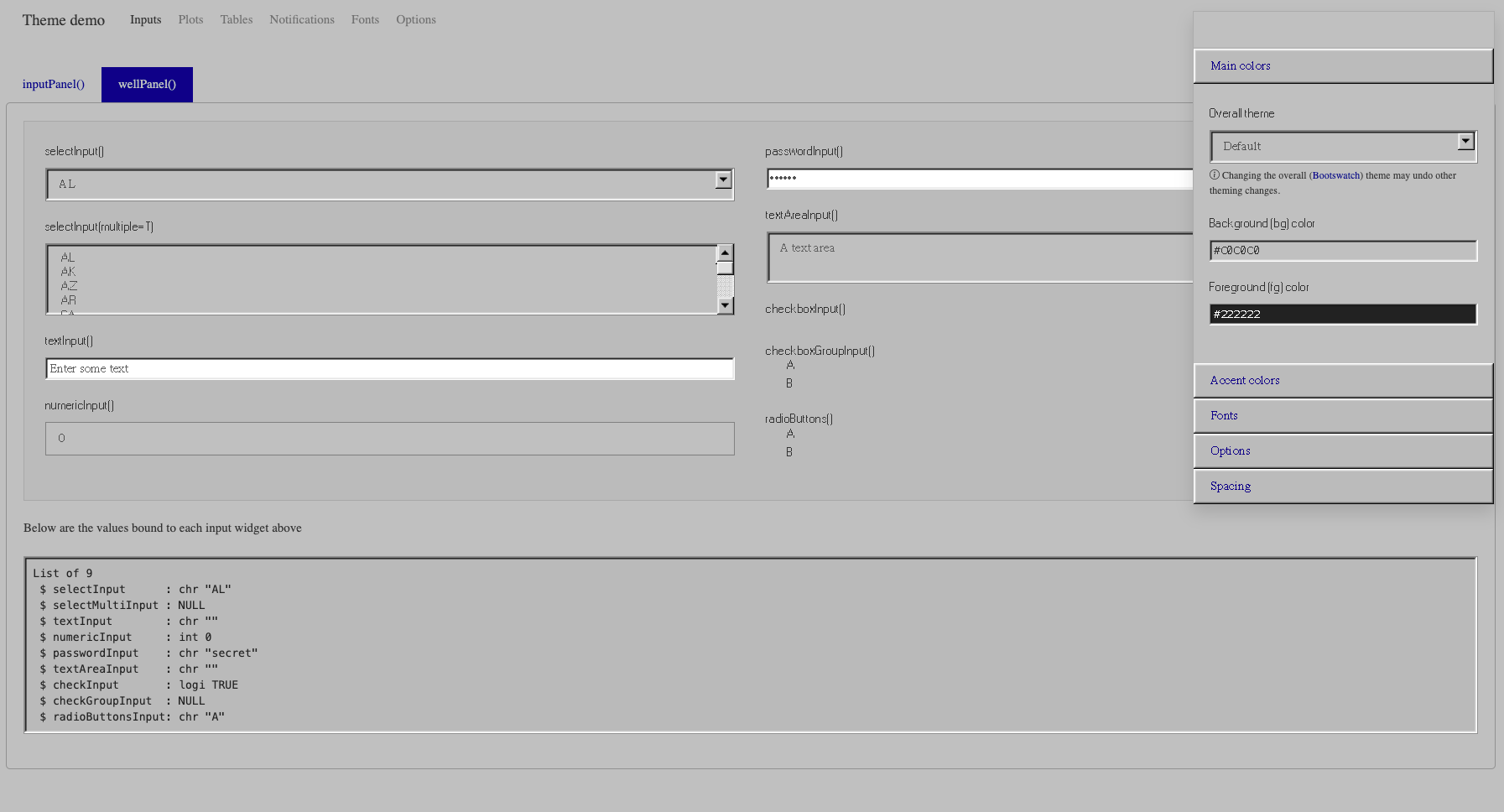
FIGURE 9.5: Modern Windows 98 theme for Shiny.
9.3 Dynamic theming
9.3.1 Basics
Now, let’s say you design an app and want to give the choice between the vanilla Shiny design and your new cyberpunk theme, created in the previous section. We leverage the new session$setCurrentTheme feature that allows bslib-generated themes to pass to JavaScript through the session object. Our Shiny app contains a Bootstrap 4 toggle defined by the theme_toggle() function, whose value is either TRUE or FALSE. On the JavaScript side, we first create a custom Shiny input with Shiny.setInputValue that gets the current mode value from the toggle. If TRUE, then the custom theme is applied by session$setCurrentTheme in an observeEvent().
theme_toggle <- function() {
  div(
    class = "custom-control custom-switch",
    tags$input(
      id = "custom_mode",
      type = "checkbox",
      class = "custom-control-input",
      onclick = HTML(
        "Shiny.setInputValue(
          'dark_mode',
          document.getElementById('custom_mode').value
        );"
      )
    ),
    tags$label(
      "Custom mode?",
      `for` = "custom_mode",
      class = "custom-control-label"
    )
  )
}
If FALSE, we fall back to a default Bootstrap 4 theme provided by bs_theme(version = 4).
Like for fresh, the bslib theme does not apply to static plots, as they are not HTML elements. Therefore we load thematic.
### RUN ###
# OSUICode::run_example(
#  "bslib/dynamic-theming",
#   package = "OSUICode"
# )

### APP CODE ###
library(shiny)
library(bslib)
library(thematic)
library(OSUICode)

default <- bs_theme(version = 4)

ui <- fluidPage(
  theme = default,
  theme_toggle(),
  sliderInput("obs", "N:", min = 0, max = 10, value = 5),
  plotOutput("distPlot")
)

server <- function(input, output, session) {
  observeEvent(input$custom_mode, {
    session$setCurrentTheme(
      if (input$custom_mode) bslib_neon_theme else default
    )
  })

  output$distPlot <- renderPlot({
    hist(rnorm(input$obs))
  })
}

thematic_shiny()
shinyApp(ui, server)
At the time of writing, an issue with bindCache() not aware of session$setCurrentTheme() is described at https://github.com/rstudio/shiny/issues/3208, with {shiny} 1.6.0. Moreover, session$setCurrentTheme() is not able to handle dynamic change of Bootstrap version.
A common mistake would be to forget to specify the session object in the server function, which would cause session$setCurrentTheme() to fail. Be careful!
9.3.2 Custom elements
For elements other than core Shiny components like numericInput() or thematic compatible elements such as plotOutput(), bslib provides tools to design dynamically themeable custom components.
Let’s take the example of a simple card where the Sass code is defined below:
-
.supercardhas a shadow, takes half of the page width and has a fixed height. Notice thebackground-colorthat takes the value of the$primarySass variable, inherited from Bootstrap 4. -
.supercard_bodyadds padding to the card body content.
.supercard {
  box-shadow: 0 4px 10px 0 rgb(0, 0, 0), 0 4px 20px 0
  rgb(0, 0, 0);
  width: 50%;
  height: 200px;
  background-color: $primary;

  .supercard_body {
    padding: 0.01em 16px;
  }
}
Below, for convenience, we put that Sass code inside a R string, even though best practice would
be to save it in a file and compile it with sass_file().
sass_str <- "
  .supercard {
    box-shadow: 0 4px 10px 0 rgb(0, 0, 0), 0 4px 20px 0
    rgb(0, 0, 0);
    width: 50%;
    height: 200px;

    background-color: $primary;
    .supercard_body {
      padding: 0.01em 16px;
    }
}"
If you try to run sass(input = sass_str),
it will fail, as $primary is not defined. Now, the goal is to link this custom Sass code
to the main app theme, created with bs_theme(). We invoke the bs_dependency() function where:
-
input refers to a list of Sass rules, that is
sass_strin our example. -
theme is a theme generated with
bs_theme(). -
name and
versionare metadata.
In case we are not in a bslib context, i.e. the app does not pass a bs_theme() element,
we create a fallback containing the card CSS code:
super_card_dependency <- function(theme) {

  dep_name <- "supercard"
  dep_version <- "1.0.0"

  if (is_bs_theme(theme)) {
    bs_dependency(
      input = sass_str,
      theme = theme,
      name = dep_name,
      version = dep_version
    )
  } else {
    htmlDependency(
      name = dep_name,
      version = dep_version,
      src = "supercard-1.0.0/css",
      stylesheet = "super-card.css",
      package = "OSUICode"
    )
  }
}
As shown, in Chapter 4, we have to add this dependency to the card
tag. Importantly, we wrap it inside bs_dependency_defer() that enables us to dynamically update the theme on the server
side, each time session$setCurrentTheme is called:
super_card <- function(...) {
  div(
    class = "supercard",
    div(class = "supercard_body", ...),
    bs_dependency_defer(super_card_dependency)
  )
}
We then create a simple dark theme that will be utilized by session$setCurrentTheme and run the app:
dark_theme <- bs_theme(version = 4) %>%
  bs_theme_update(
    bg = "black",
    fg = "white",
    primary = "orange"
  )
### RUN ###
# OSUICode::run_example(
#  "bslib/custom-components",
#   package = "OSUICode"
# )

### APP CODE ###
library(shiny)
library(bslib)
library(OSUICode)

ui <- fluidPage(
  theme = bs_theme(),
  theme_toggle(),
  br(),
  super_card("Hello World!")
)

server <- function(input, output, session) {
  observeEvent(input$custom_mode, {
    session$setCurrentTheme(
      if (input$custom_mode) {
        bslib_dark_theme
      } else {
        bs_theme(version = 4)
      }
    )
  })
}

shinyApp(ui, server)
Live theming requires the session parameter to the server function. Don’t forget it!
The reader is invited to exploit the run_with_themer() capabilities, which allows users to dynamically modify the current theme, as shown later in Figure 9.6.
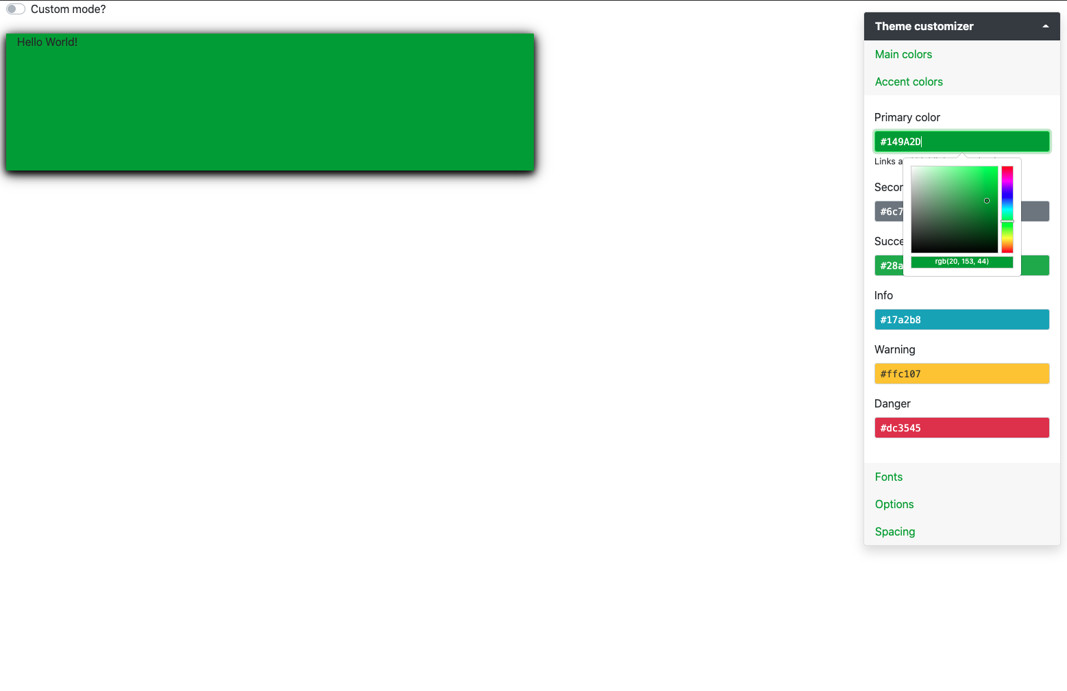
FIGURE 9.6: Theme preview with custom component.
Below, we try without passing any theme to fluidPage(), to test our CSS fall back strategy:
ui <- fluidPage(super_card("Hello World!"))
server <- function(input, output) {}
shinyApp(ui, server)
9.3.3 Conditional rendering
9.3.3.1 Bootstrap badges
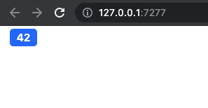
In this section, we see how to create components whose rendering may adapt depending on the currently active theme properties, like the current Bootstrap version. Bootstrap badges have slightly different structures between Bootstrap 3 and Bootstrap 4/5:
<!-- BS3 -->
<span class="badge">42</span>

<!-- BS4 -->
<span class="badge badge-secondary">New</span>

<!-- BS5 -->
<span class="badge bg-secondary">New</span>
Bootstrap 3 badges don’t have any color class contrary to Bootstrap 4 or 5. Bootstrap 4 and 5 badges color classes slightly differ: badge-<COLOR> (BS4) vs bg-<COLOR> (BS5). Below, let’s write a common wrapper to create a bs_badge() function for Shiny that works for all Bootstrap versions. No question to create three different functions!
The common skeleton tag is a simple span element with the badge class. Depending on the version, we
create a render hook with htmltools::tagAddRenderHook() that is able to adequately alter the tag structure. We first get the currently active theme with shiny::getCurrentTheme() or bslib::bs_current_theme(). We check if it is a bslib theme, and if yes, we recover its version with bslib::theme_version(). Note the importance of timing. Calling shiny::getCurrentTheme() outside the render hook would give NULL, thereby preventing the code from working. We raise an error if color is used whenever the Bootstrap version is lower than 4. In case of Bootstrap 4 or 5, we utilize htmltools::tagQuery() to efficiently modify the tag structure in one single flow of instructions, as shown in section 2.6. The result is shown below:
bs_badge <- function(text, color = NULL) {
  # Create common badge skeleton for BS3/4/5
  badge_skeleton <- tags$span(class = "badge", text)

  # Handle BS4 and BS5 extra class
  if (!is.null(color)) {
    badge_skeleton <- tagAddRenderHook(
      badge_skeleton, function(x) {
      # get theme and version
      theme <- getCurrentTheme()
      version <- if (bslib::is_bs_theme(theme)) {
        bslib::theme_version(theme)
      }

      switch(
        version,
        # stop if color is used with BS3
        "3" = stop(
          sprintf(
            "color is not available for Bootstrap %s",
            version
          )
        ),
        "4" =  tagQuery(x)$
          addClass(sprintf("badge-%s", color))$
          allTags(),
        "5" = tagQuery(x)$
          addClass(sprintf("rounded-pill bg-%s", color))$
          allTags()
      )
    })
  }

  badge_skeleton

}
Let’s test it below, with the result illustrated Figure 9.7.
# BS3
ui <- fluidPage(
  theme = bs_theme(version = 3),
  bs_badge(42)
)
server <- function(input, output, session) {}

shinyApp(ui, server)

# BS4
ui <- fluidPage(
  theme = bs_theme(version = 4),
  bs_badge(42, "primary")
)
shinyApp(ui, server)

# BS5
ui <- fluidPage(
  theme = bs_theme(version = 5),
  bs_badge(42, "primary")
)
shinyApp(ui, server)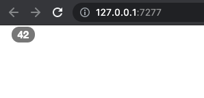
FIGURE 9.7: Conditional rendering of a Bootstrap component. Left: BS3 badge; center: BS4 badge; right: BS5 badge.
9.3.3.3 Guided exercise: Bootstrap accordions
We conclude this part with a guided exercise. Similarly to badges, Bootstrap accordions differ between the three last major versions. First, they don’t natively exist in Bootstrap 3, and the tag structure is different between Bootstrap 4 and 5. The purpose of this activity is to provide a generalized wrapper that would support all versions.
Figure 9.8 illustrates the Bootstrap 5 accordion. It is composed of items that can collapse if one clicks on their title. Overall, they are convenient to save space in any user interface, when the amount of text would be to much to be printed at once.
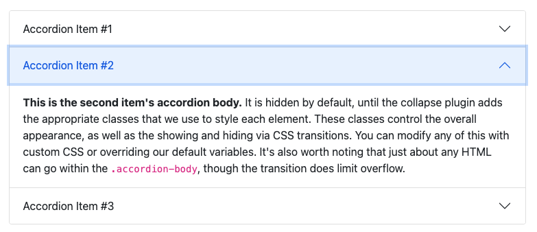
FIGURE 9.8: A Bootstrap 5 accordion.
From an HTML point of view, the accordion has a main div wrapper with the accordion class, inside of which are found the accordion items. Whereas in Bootstrap 5, these elements are div with the accordion-item class, Bootstrap 4 considers div with card class. An accordion item is composed of a title with a button, which is able to control the collapsed state of the linked body part, the latter being a simple div. The link is made with the data-bs-target attribute on the title that must match the id attribute of the body part. The data-bs-toggle activates the JS, which makes the whole component collapse. Each body element refers to the parent accordion with data-bs-parent that must match the parent id, thereby guarantying no unwanted interaction between multiple accordions. Below is the HTML structure of the BS5 accordion:
<!-- BS5 -->
<div class="accordion" id="accordionExample">
  <div class="accordion-item">
    <h2 class="accordion-header" id="headingOne">
      <button
      class="accordion-button"
      type="button"
      data-bs-toggle="collapse"
      data-bs-target="#collapseOne"
      aria-expanded="true"
      aria-controls="collapseOne">
        Accordion Item #1
      </button>
    </h2>
    <div
    id="collapseOne"
    class="accordion-collapse collapse show"
    aria-labelledby="headingOne"
    data-bs-parent="#accordionExample">
      <div class="accordion-body">
        Blablabla
      </div>
    </div>
  </div>
  <!-- Other items ... -->
</div>
and the BS4 accordion:
<div class="accordion" id="accordionExample">
  <div class="card">
    <div class="card-header" id="headingOne">
      <h2 class="mb-0">
        <button
        class="btn btn-link btn-block text-left"
        type="button"
        data-toggle="collapse"
        data-target="#collapseOne"
        aria-expanded="true"
        aria-controls="collapseOne">
          Accordion Item #1
        </button>
      </h2>
    </div>

    <div
    id="collapseOne"
    class="collapse show"
    aria-labelledby="headingOne"
    data-parent="#accordionExample">
      <div class="card-body">
        Blablabla
      </div>
    </div>
</div>- Compare the Bootstrap 4 and 5 HTML code. What are the differences? Is the tag structure the same? Are there differences for tag attributes?
- Based on the previous question, create the
bs_accordion()function. This function starts by defining a tag structure common to BS4 and BS5.
bs_accordion <- function(id, items) {
  # main wrapper
  accordion_tag <- tags$div(
    class = "accordion",
    id = ...,
    items
  )

  accordion_tag
}- Let’s handle the Bootstrap differences for
bs_accordion(). As shown above, leveragetagAddRenderHook(). First, create theget_theme_version()function to detect the currently used theme version. Then call this function inside thetagAddRenderHook()and store it in theversionvariable.
# Function to get the current them version
get_theme_version <- function() {
  theme <- bslib::...
  if (bslib::...(theme)) bslib::...(theme)
}

bs_accordion <- function(id, items) {

  # Accordion wrapper (see 2 above)

  tagAddRenderHook(accordion_tag, function(x) {
    # get theme version
    version <- ...
  })
}- Now, we’ll edit
tagAddRenderHook()so that we raise an error if the Bootstrap version is3. Edit thebs_accordion()to incorporate the below code.
- We are good with the main wrapper. Let’s create the
bs_accordion_item()function, which will have to be nested inside thebs_accordion(). We assume it has two main parameters, title and content. To get a better code, we’ll design intermediate components for the header and the body. In this step, we only create the body element since the header is slightly more complex to handle. If you have had a look to the HTML structure, you will notice below thatid,aria-labelledbyanddata-(bs)-parentwill be handled later from thebs_accordion(). These parameters require knowing thebs_accordion()id, which is impossible to get within a child element. We also added anactiveparameter to control the start state. Fill in the...element below.
bs_accordion_item <- function(title, content) {

  item_body <- tags$...(
    # id will be added from bs_accordion
    # aria-labelledby also added from bs_accordion
    # data parent differs between BS4 and BS5
    class = paste("collapse", if (active) ...),
    tags$div(
      # class differs between BS4 and BS5
      ...
    )
  )

  # accordion item wrapper
  tags$div(
    # class differs between BS4 and BS5
    ...
  )
}- Utilize
tagAddRenderHook()to handle BS4 and BS5 differences inbs_accordion_item(). As inbs_accordion(), recover the version withget_theme_version(). Then, create the Bootstrap 4 item header based on its HTML structure shown above.
bs_accordion_item <- function(title, content, active = FALSE) {

  # item body code 5 (see above)
  # item wrapper 5 (see above)

  tagAddRenderHook(..., function(x) {
    # get theme and version
    version <- ...

    # create accordion item header
    ... <- if (version == "4") {
      tags$div(
        class = ...,
        # id will be added from bs_accordion
        tags$h2(
          class = "mb-0",
          tags$button(
            class = ...,
            type = "button",
            `data-toggle` = "collapse",
            # data-target will be added from bs_accordion
            `aria-expanded` = tolower(...),
            # aria-controls will be added from bs_accordion
            title
          )
        )
      )
    }
  }
}- Add an
else ifstatement to handle Bootstrap 5, based on its HTML structure, provided above.
else if (version == "5") {
  tags$h2(
    class = ...,
    tags$button(
      class = ...,
      type = "button",
      `data-bs-toggle` = "collapse",
      `aria-expanded` = tolower(...),
      title
    )
  )
}- We now have to handle missing classes and add the new elements. We created a switch to start handling Bootstrap 4 and Bootstrap 5 differences. Based on the accordion item HTML structure, fill in the missing
tagQuery()steps for Bootstrap 4.
bs_accordion_item <- function(title, content, active = FALSE) {

  # item body code (see 5 above)
  # item wrapper (see above)

  tagAddRenderHook(..., function(x) {
    # get theme and version (see 6 above)
    # create accordion item header (see 6-7 above)

    # alter tag structure
    switch(
      version,
      # don't need to handle BS3
      "4" =  tagQuery(x)$
        addClass(...)$
        # prepend header tag
        prepend(...)$
        find(".collapse")$
        children()$
        # add class to item body
        addClass(...)$
        allTags()
    )
  })
}- Do the same for Bootstrap 5.
bs_accordion_item <- function(title, content, active = FALSE) {
  # item body code (see 5 above)
  # item wrapper (see 5 above)

  tagAddRenderHook(..., function(x) {
    # get theme and version (see 6 above)
    # create accordion item header (see 6-7 above)

    # alter tag structure
    switch(
      version,
      # don't need to handle BS3
      "4" =  # see 8 above,
      "5" = tagQuery(x)$
        addClass(...)$
        prepend(...)$
        find(".collapse")$
        addClass("accordion-collapse")$
        children()$
        addClass(...)$
        allTags()
    )
  })
}- We come back to
bs_accordion()in order to create the correctbs_accordion_item()children ids (mentioned in 5) and treat missing attributes. We have to process all items and uselapply()since it works well with Shiny tags. All nested item ids are prefixed by the parent accordion id; for instance we can writepaste(id, "heading", i, sep = "_"), whereidrefers to the parent accordion andiis the current item within thelapplyloop. This is to avoid uniqueness issue in case multiple accordions are present in the code, which would ultimately prevent the accordion from behaving properly. Then, items are resolved withhtmltools::as.tags(), as explained in section 2.6.7.2. Fill in the blanks....
bs_accordion <- function(id, items) {

  # Accordion wrapper (see 2 above)

  tagAddRenderHook(accordion_tag, function(x) {
    # get theme and version (see 3 above)
    # Check version (see 3 above)

    # process accordion items to add missing attributes
    new_items <- lapply(seq_along(...), function(i) {

      # temp ids based on the parent id
      heading_id <- paste(..., "heading", i, sep = "_")
      controls_id <- paste0(..., "_collapse_", i)
      target_id <- paste0("#", controls_id)

      # resolve bs_accordion_item
      items[[i]] <- as.tags(...)

      # see 11
    })
    # see 13
  })
}- Right after the
as.tags()function, add a switch to handle the Bootstrap 4 version. Fill in the blanks.... Overall these codes add missing attributes so that the accordion works properly.
# handle BS4
switch(
  version,
  "4" = tagQuery(...[[i]])$
    find(".card-header")$
    addAttrs("id" = ...)$
    find(".btn")$
    addAttrs(
      "data-target" = ...,
      "aria-controls" = ...
    )$
    resetSelected()$
    find(".collapse")$
    addAttrs(
      "id" = ...,
      "aria-labelledby" = ...,
      "data-parent" = paste0("#", ...)
    )$
    allTags(),
  "5" = # see 12
)- Add a Bootstrap 5 case to the switch filling the following code.
tagQuery(...[[i]])$
  find(".accordion-header")$
  addAttrs("id" = ...)$
  children()$
  addAttrs(
    "data-bs-target" = ...,
    "aria-controls" = ...
  )$
  resetSelected()$
  find(".accordion-collapse")$
  addAttrs(
    "id" = ...elt(),
    "aria-labelledby" = ...,
    "data-bs-parent" = paste0("#", id)
  )$
allTags()- Add the newly processed accordion items at the end of the
bs_accordion()render hook, paying attention to fill the blank.
# alter main tag structure
tagQuery(x)$
  # replace accordion items processed above
  empty()$
  append(...)$
allTags()- We create a Shiny app to test the newly designed components with Bootstrap 4. You may use
bs_theme(version = 5)to handle Bootstrap 5.
### RUN ###
# OSUICode::run_example(
#  "bslib/conditional-rendering/bs4-accordions",
#   package = "OSUICode"
# )

### APP CODE ###
library(shiny)
library(bslib)
library(OSUICode)

ui <- fluidPage(
  theme = bs_theme(version = 4),
  bs_accordion(
    id = "accordion",
    items = tagList(
      bs_accordion_item(
        title = "Item 1",
        "Item 1 content",
        active = TRUE
      ),
      bs_accordion_item(
        title = "Item 2",
        "Item 2 content"
      )
    )
  )
)

server <- function(input, output, session) {}
run_with_themer(shinyApp(ui, server))
Figure 9.9 shows the expected output for Bootstrap 4 and 5. Solutions may be found in the {OSUICode} package (see https://github.com/DivadNojnarg/outstanding-shiny-ui-code/blob/b95f656bce9de7600c05b5045a4e005f70c4f83d/R/bslib-utils.R#L166).
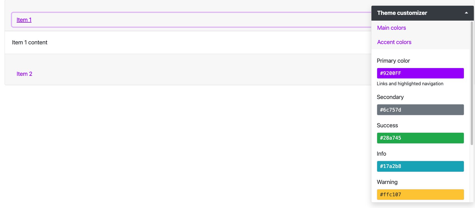
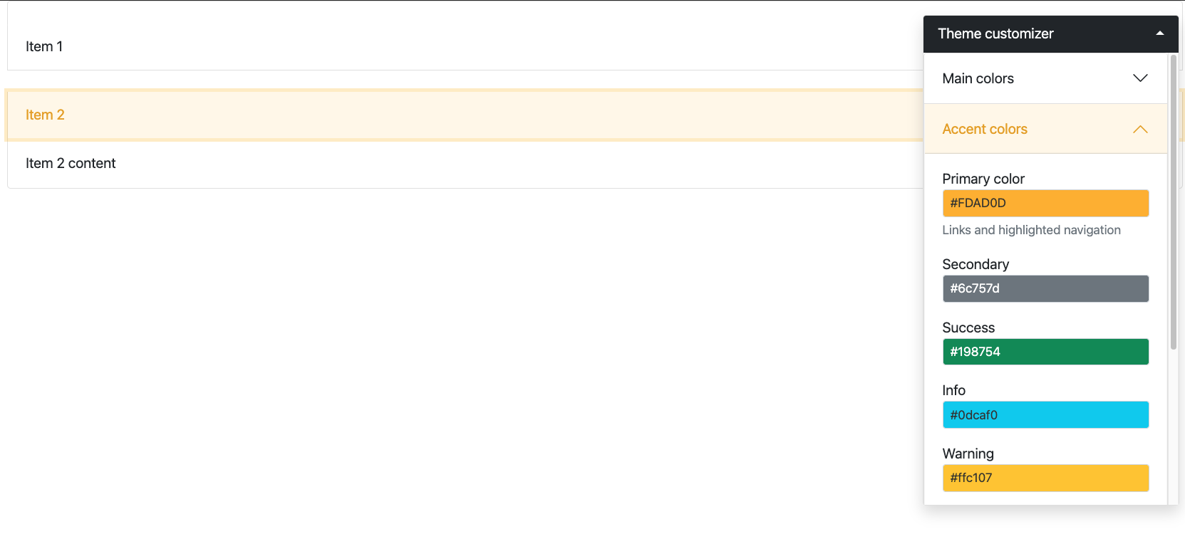
FIGURE 9.9: Bootstrap accordions for Shiny. Top: BS4 accordion; bottom: BS5 accordion.