23 Reconstruct {shinyMobile}
This section has been written and tested with Framework7 5.7.14.
Some feature may change in future releases.
However, fear not! The process follows the same general principles.
As a reminder, the code examples shown throughout this chapter are gathered in the {OSUICode} package accessible at https://github.com/DivadNojnarg/OSUICode/tree/1d42aa7531705954d3c21921c8bbb10623b20d12.
23.1 Introduction to Framework7
Framework7 is the HTML/CSS/JavaScript engine that fuels shinyMobile. It is a flexible toolkit to build native-looking web apps or progressive web apps (PWA). It has an incredibly rich ecosystem:
- Provides a core JavaScript API, React API, Vue API, Svelte API.
- A CLI (command line interface) to ease the creation of PWA, provide boilerplate and starter templates.
- A full set of native icons.
- Hundreds of components with different looks for iOS and material design, even desktop.
- A comprehensive set of documentation.
- A supportive community.
23.2 Initiate the package
This is time to initialize the package structure and extract the Framework7 dependencies. To get an idea of the package file structure, we run:
get_dependency_assets("framework7", tag = "5.7.14")
# Output was manually truncated for formatting reasons
#> $url
#> [1] "https://cdn.jsdelivr.net/npm/framework7@5.7.14/"
#>
#> $files
#>                                 name
#> 2          framework7.bundle.min.css
#> 6                 framework7.min.css
#> 11          framework7.bundle.min.js
#> 15                 framework7.min.js
#> 18         framework7-lite.bundle.js
#> 19     framework7-lite.bundle.min.js
#> 23            framework7-lite.min.js
#>                                            hash
#> 2  P0Yv9hUd1e2zLYv9F3eEiJ29wz3ZOSIbdHGEj3Jwzyo=
#> 6  fYS3dYPbdZeiQAM9wTUQiLP82ZTcVoA970gb2Ov7EFY=
#> 11 k0i6vZYYH7MIgZvxSp4eQFS2HCEXy1ae5BF/YWSMyys=
#> 15 FJ+5ZHj8V2fzT7Lts0ELaWSC4ZJtmxQzRuWeWwke9a0=
#> 18 EiVuejoa3kTItzhZ5mw7WhB+Ah75R5HpM+34hijj7wA=
#> 19 LKMinGOXYGPI4wdD4ZIPp5kx84PP3f7EkD8dUxFPRAI=
#> 23 liT0rss/O3G2MtXQ3/zAu+8jmTrrPhwiqV+Pd58qJJo=
#>
#> $hasSubfolders
#> [1] TRUE
We browse the package page,
which provides details about all necessary components. We are going to use the bundle version since
the lite approach is missing several components, particularly Framework7 widgets. We therefore target framework7.bundle.min.js and framework7.bundle.min.css:
path <- file.path(tempdir(), "shinyMobile")
create_charpente(path, license = "mit")
Once the package is created and opened, we download Framework7 dependencies, specifying
the following version, that is, 5.7.14, and targeting bundle.min files by setting charpente_options(bundle = TRUE) (default to FALSE):
create_dependency(
  "framework7",
  tag = "5.7.14",
  options = charpente_options(bundle = TRUE)
)
Besides, this generates the framework7-dependencies.R script:
add_framework7_deps <- function(tag) {
 framework7_deps <- htmltools::htmlDependency(
  name = "framework7",
  version = "5.7.14",
  src = c(file = "framework7-5.7.14"),
  script = "js/framework7.bundle.min.js",
  stylesheet = "css/framework7.bundle.min.css",
  package = "shinyMobile",
 )
 htmltools::tagList(tag, framework7_deps)
}
23.3 Framework7 layouts
Framework7 has three predefined layouts (Figure 23.1):
- Single-page layout.
- Multi-tabs layout.
- Split layout, targeting tablet/desktop. It is composed of a sidebar and a main panel.
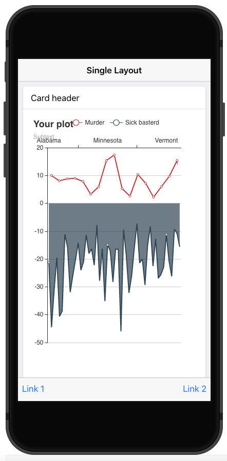
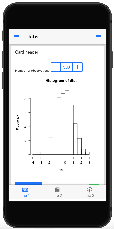
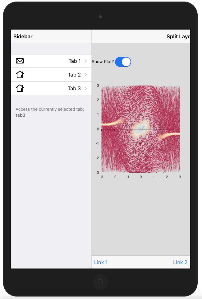
FIGURE 23.1: Framework7 layouts.
Let’s start simple and choose the single-page layout, whose corresponding HTML is given by:
<!DOCTYPE html>
<html>
  <head>
    <!-- Head content (see below) -->
  </head>
  <body>
    <!-- App root element (see below) -->

    <!-- Path to Framework7 Library Bundle JS-->
    <script type="text/javascript"
      src="path/to/framework7.bundle.min.js"></script>
    <!-- Path to your app js-->
    <script type="text/javascript"
      src="path/to/my-app.js"></script>
  </body>
</html>
The head tag contains meta tags (some are required for PWA features), which are discussed in the next Chapter 24.
The most important part is the dependencies that will be included. Note that
the order matters: Framework7 dependencies go first, other dependencies follow.
<head>
  <!-- Required meta tags-->
  <meta charset="utf-8">
  <meta name="viewport" content="width=device-width,
    initial-scale=1, maximum-scale=1, minimum-scale=1,
    user-scalable=no, viewport-fit=cover">
  <meta name="apple-mobile-web-app-capable" content="yes">
  <!-- Color theme for statusbar (Android only) -->
  <meta name="theme-color" content="#2196f3">
  <!-- Your app title -->
  <title>My App</title>
  <!-- Path to Framework7 Library Bundle CSS -->
  <link rel="stylesheet"
    href="path/to/framework7.bundle.min.css">
  <!-- Path to your custom app styles-->
  <link rel="stylesheet" href="path/to/my-app.css">
</head>
The body tag is composed of several layers. The first one is the app root element, which is crucial to the template initialization. We’ll come back to that point in the next section.
<!-- App root element -->
<div id="app">
  <!-- Your main view, should have "view-main" class -->
  <div class="view view-main">
    <!-- Initial Page -->
    <div class="page">
      <!-- Top Navbar -->

      <!-- Bottom Toolbar -->

      <!-- Scrollable page content -->

    </div>
  </div>
</div>
Then, we find the view component, inside which is located the page, which hosts the navbar, toolbar (bottom bar) and the page content.
<!-- Top Navbar -->
<div class="navbar">
  <div class="navbar-bg"></div>
  <div class="navbar-inner">
    <div class="title">Awesome App</div>
  </div>
</div>

<!-- Bottom Toolbar -->
<div class="toolbar toolbar-bottom">
  <div class="toolbar-inner">
    <!-- Toolbar links -->
    <a href="#" class="link">Link 1</a>
    <a href="#" class="link">Link 2</a>
  </div>
</div>

<!-- Scrollable page content -->
<div class="page-content">
  <p>Page content goes here</p>
  <!-- Other content -->
</div>
Although, Framework7 inserts JavaScript code at the end of the body, we can include them in the head as well.
Leveraging the charpente html_2_R(), we convert the previous code to R and extract the f7_page() function. We replace the title content with a title parameter, paying attention to remove all CSS and JS links, as they are already included with the add_dependencies() function applied to body. The page content is contained in a ... parameter.
We also move the navbar and toolbar content to create two other layout functions. Meta tags are commented to save space in the book, but are available here:
f7_page <- function(..., navbar, toolbar, title = NULL) {
  tagList(
    tags$head(
      # Meta tags are commented for space reasons
      tags$title(title)
    ),
    add_dependencies(
      tags$body(
        tags$div(
          id = "app",
          tags$div(
            class = "view view-main",
            tags$div(
              class = "page",
              navbar,
              toolbar,
              tags$div(class = "page-content", ...)
            )
          )
        )
      ),
      deps = "framework7"
    )
  )
}
Below are the navbar and toolbar components. The navbar has only a title parameter, and
the toolbar may contain items in a ... parameter. In practice, they may contain more elements, but this is enough for now:
f7_navbar <- function(title) {
  tags$div(
    class = "navbar",
    tags$div(class = "navbar-bg"),
    tags$div(
      class = "navbar-inner",
      tags$div(
        class = "title",
        title
      )
    )
  )
}

f7_toolbar <- function(...) {
  tags$div(
    class = "toolbar toolbar-bottom",
    tags$div(
      class = "toolbar-inner",
      ...
    )
  )
}
Don’t forget to regularly insert roxygen documentation with the insert roxygen skeleton RStudio feature (Figure 23.2) and run devtools::document(), devtools::load_all().
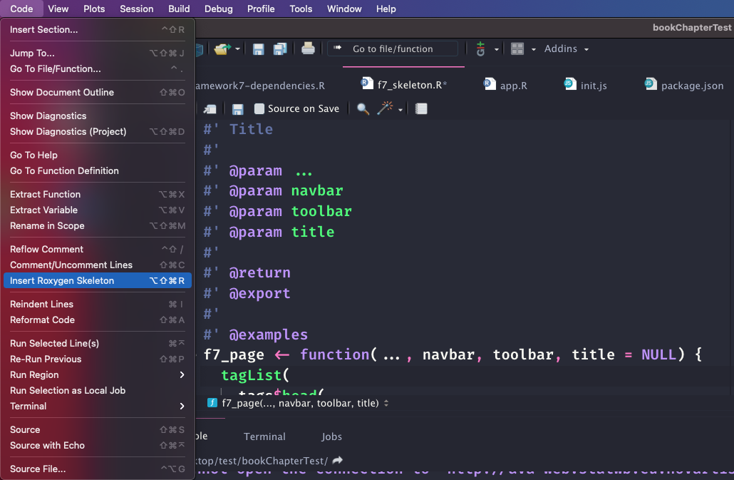
FIGURE 23.2: RStudio helper to add roxygen2 skeleton to any R function.
At this point, we can try to run a simple Shiny app. Best practice is to save the app.R file in the ./inst/demo folder:
library(shiny)

ui <- f7_page(
  "Test",
  navbar = f7_navbar("Title"),
  toolbar = f7_toolbar(),
  title = "shinyMobile"
)

server <- function(input, output, session) {}
shinyApp(ui, server)
which displays nothing, but returns no error. We actually forgot the app initialization step.
23.4 App initialization
This step is mandatory to activate all template components (router, panels, …).
We create a custom script with create_js, which automatically updates the charpente provided main.js entry point:
create_js("init")We add the following piece of JS inside init.js:
$( document ).ready(function() {
  app = new Framework7({
    // App root element
    root: '#app',
    // App Name
    name: 'My App',
    // other options
  });
});
Importantly, we made app global so as to access it in other scopes. There is currently no easy way to work around this issue.
Most of the code inside init.js is wrapped in a function that waits for the document to be ready before interacting with the DOM. This is necessary since the configuration is retrieved from a script DOM element inserted when the application starts, thus not immediately available. If you try to remove the $( document ).ready(function(...)});, an error will be raised since the configuration cannot be properly retrieved.
This script creates the app instance necessary to leverage Framework7 methods,
initialize other widgets, interact with layout elements and listen to app events (offline, online, …). Since the root element is a direct child of the body, the root property is not
mandatory. The full configuration list may be found here.
The next step consists of initializing the main view, we add this line right after the app creation:
let mainView = app.views.create('.view-main');Once done, we compress the corresponding JS file to create the shinyMobile.min.js code,
update the f7_page() to include the new dependency, after the Framework7 one, and document the package to set up the package imports:
build_js()

# updated f7_page
f7_page <- function(..., navbar, toolbar, title = NULL) {
  tagList(
    tags$head(
      # Head content (unchanged)
    ),
    add_dependencies(
      # Body tag (unchanged)
      deps = c("framework7", "shinyMobile")
    )
  )
}

# Initialize NAMESPACE file
devtools::document()
The working app is shown in Figure 23.3. The right panel displays the developer tools inside which we can seamlessly debug the JS code, by leveraging source maps.
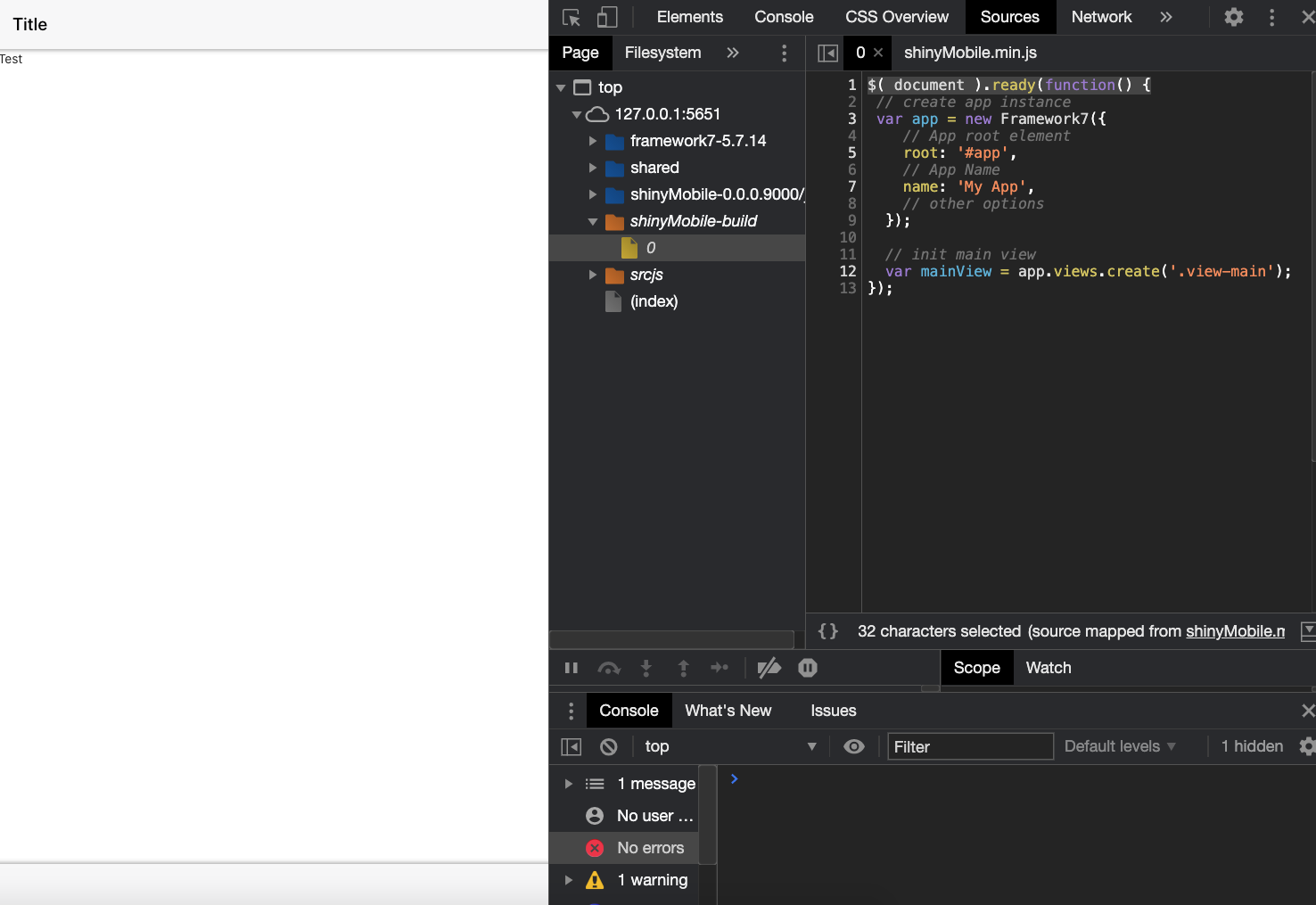
FIGURE 23.3: First working {shinyMobile} app.
From now, we can add a welcome notification message with the notification API. There are two steps:
- Create the notification instance with
app.notification.create(parameters). - Tell the app to open the notification at start with
app.notification.open().
We add the following code to init.js and call build_js():
let notification = app.notification.create({
  text: 'Welcome to shinyMobile!',
  on: {
    opened: function () {
      console.log('Notification opened');
    }
  }
}).open();
It opens at app start up and closes on swipe gesture. The Framework7 API is quite easy to understand and extremely powerful. Chapter 25 gives a better introduction to the main Framework7 widgets.
23.5 App configuration
The app object has a tremendous amount of methods and parameters. In this section, we briefly describe the most significant and how to set them up.
Among all parameters, there are metadata parameters like name and version. Once the app initialized, all app parameters are accessible with the . notation. For instance, if you set a version number, it is accessible later with app.version.
23.5.1 Global theme
theme controls the overall app design (Figure 23.4):
-
ioscorresponds to the iOS design. -
mdstands for material design. -
aurorais a desktop optimized design.
As this parameter is set to auto, Framework7 detects the
current device stored in app.device, and accordingly adapts the design. Nothing prevents you from forcing the iOS layout on android devices, even though being quite irrelevant. Here are many properties to review.
FIGURE 23.4: Framework7 skins: iOS (left), md (right).
23.5.2 Events
The app is able to emit events whenever relevant like init, resize, online, offline, which
allows us to add interactivity:
app = new Framework7({
  on: {
    init: function () {
      console.log('App initialized');
    },
    // other events
  }
});
23.5.3 Components configuration
All Framework7 components are highly customizable. Yet, if you know that some
parameters are not going to change, it is a good idea to make them global and share them
across all instances. For example, notifications have global options. Let’s add this code
to the init.js script directly inside the var app = new Framework7({ ... }):
notification: {
  title: 'My App',
  closeTimeout: 3000,
}
This means all notifications will close after 3 seconds and have the My App title. We rebuild the JS code with build_js() and run the previous app example. We add another notification to the init.js script with a delay of 1 second so as to test this global feature. Note the use of the internal Framework7 utils app.utils.nextTick, which is nothing more than a setTimeout function
let otherMessage = app.notification.create({
  text: 'You look great!'
});

// equivalent to setTimeout ...
app.utils.nextTick(function() {
  otherMessage.open();
}, 1000);
23.5.4 Allow end-user configuration
In the above sections, we described some parameters to configure the app. Yet, we did set up all values directly in JavaScript. How do we allow the end user to provide their very own parameters?
The idea is the following:
- We create an options argument in the
f7_page()function, which accepts a list of parameters. - We convert it to the JSON format and store it in a tag, ideally next to the
bodyelement. - We recover those data on the JS side and update the app initialization method.
The f7_page() may be accordingly modified. We convert the options list to a JSON with jsonlite::toJSON and embed it in a script tag (as a reminder, we exploit this method in section 12.2).
The data-for attribute with the id attribute guarantees the uniqueness of our configuration script:
config_tag <- shiny::tags$script(
  type = "application/json",
  `data-for` = "app",
  jsonlite::toJSON(
    x = options,
    auto_unbox = TRUE,
    json_verbatim = TRUE
  )
)
We then create an intermediate body_tag component where we insert the configuration tag.
f7_page <- function(..., navbar, toolbar, title = NULL,
                    options = NULL) {

  # Create config (see above)

  # create body_tag
  body_tag <- tags$body(
    # Body content (unchanged)
    # Config tag
    config_tag
  )

  tagList(
    tags$head(
      # Head content (unchanged)
    ),
    add_dependencies(
      body_tag,
      deps = c("framework7", "shinyMobile")
    )
  )
}
On the JS side, the data collection must occur before the app initialization and is quite easy with the jQuery find method:
let config = $(document).find('script[data-for="app"]');
config = JSON.parse(config.html());
We accordingly update the app initialization:
app = new Framework7({
  // App root element
  root: '#app',
  // App Name
  name: 'My App',
  version: config.version,
  // other options
  theme: config.theme,
  notification: {
    closeTimeout: 3000
  }
});
What happens if the user forgets to supply the version number? data.version is undefined
and the app still works! The biggest advantage of this approach is the fact that all TRUE
and FALSE (R) are converted to true and false (JS), which avoids unnecessary conversion steps.
However, we are still missing many potential configuration options. For instance, with the above code,
only root, name, version, theme, notifications, touch are considered. If the user
provides any other option, it is ignored.
In theory, this is what we could do to make sure that all elements are considered:
app = new Framework7(config);
// Don't forget to set the root!
config.root = '#app';
It is assumed that the user knows exactly what to provide in the list, especially mandatory elements.
Knowing the tremendous number of options, it might be slightly overwhelming for a new user. What we suggest is providing a default option list, say shinyMobile_options, available for f7_page():
shinyMobile_options <- list(
  theme = "auto",
  dark = TRUE,
  filled = FALSE,
  color = "#007aff",
  iosTranslucentBars = FALSE,
  navbar = list(
    iosCenterTitle = TRUE,
    hideOnPageScroll = TRUE
  ),
  toolbar = list(
    hideOnPageScroll = FALSE
  ),
  # remaining options ...
)

f7_page <- function(
  # other parameters are not mentioned
  options = shinyMobile_options
) {
  # function body ...
}
You only need to add one line of documentation in the roxygen part and write app = new Framework7(config); on the JS side, which is convenient to maintain. This approach avoids creating too many parameters, but be careful about the documentation, as it may cause frustration for the end user. Don’t forget that since config is an object,
you may add any other properties or methods, on the fly with the . notation or app.utils.extend.
You finally may ask why we put dark, color and filled in the options list given they
are not part of the app API parameters. As any unknown parameter is not considered by the Framework7 class, we can definitely keep them here, which is easier to treat on the JS side.
23.5.5 Modify configuration
As previously stated, the app configuration is passed during the initialization process, through
new Framework7(config). What if the user wants to programmatically change these options
when the app is running?
Since app parameters are located in app.params, the idea would be to extend that list:
let newParams = {
  dialog: {
    buttonOk:  'Yeaaaah!',
    buttonCancel: 'Ouuups!'
  }
}
app.utils.extend(app.params, newParams);
The above example changes the default buttons text for all modal dialog.
As far as I know, some options won’t work like the global theme, which would require re-initializing the app and is not possible.
23.5.6 Global data and methods
The Framework7 data parameters allows you to store global elements, data, and use them in different scripts:
config.data = function () {
  return {
    username: 'dgranj',
    firstName: 'David',
    lastName: 'Granjon',
    // may also be array
    widgets: []
  };
};
Similarly methods hosts all global app methods, functions you may re-use in different parts. Like for app.data, we access them with app.methods:
config.methods = {
  getUsername: function() {
    app.data.username;
  },
  // other methods
}
Framework7 6.0.0, app.data has been removed in favor of a more flexible alternative called store. It is documented here: https://framework7.io/docs/store.html.
23.5.7 Other elements
Framework7 provides mobile-specific modules like touch, which is a long press event (here 750 ms). This is something you can usually do on many mobile apps. The touch module parameters are defined as follows:
touch: {
  tapHold: true,
  tapHoldDelay: 750,
}
which translates into a named list in R:
list(
  tapHold = TRUE,
  tapHoldDelay = 750,
  # other touch options
)
To activate that feature, we update shinyMobile_options():
shinyMobile_options <- list(
  theme = "auto",
  dark = TRUE,
  filled = FALSE,
  color = "#007aff",
  iosTranslucentBars = FALSE,
  navbar = list(
    iosCenterTitle = TRUE,
    hideOnPageScroll = TRUE
  ),
  toolbar = list(
    hideOnPageScroll = FALSE
  ),
  # TOUCH MODULE OPTIONS
  touch = list(
    tapHold = TRUE,
    tapHoldDelay = 750,
    iosTouchRipple = FALSE
  )
  # remaining options ...
)
We create a button element and add to it the taphold event in init.js:
$('#mybutton').on('taphold', function () {
  app.dialog.alert('Tap hold fired!');
});
The app.R script should look like:
### RUN ###
# OSUICode::run_example(
#  "shinyMobile/taphold",
#   package = "OSUICode"
# )

### APP CODE ###
library(shiny)
library(OSUICode)

ui <- f7_page(
  allowPWA = FALSE,
  tags$div(
    class = "list inset",
    tags$ul(
      tags$li(
        tags$a(
          href = "#",
          id = "mybutton",
          class = "list-button color-red",
          "Large Red Button"
        )
      )
    )
  ),
  navbar = f7_navbar("Taphold demo"),
  toolbar = f7_toolbar(),
  title = "shinyMobile"
)

server <- function(input, output, session) {}

shinyApp(ui, server)
Once the app is running, don’t forget to open the developer tools and
set the device on mobile mode (iPhone or android) since taphold does not fire
on the desktop (Figure 23.5). You may place a breakpoint
inside the taphold event listener to check that it is properly triggered.
taphold also triggers events related to the click like text selection, which is rarely desirable. Hence, we have to add the following code to init.js, making sure to check that touch exists:
// tapHold custom css
if (config.hasOwnProperty('touch')) {
  if (config.touch.tapHold) {
    $('<style>')
      .prop('type', 'text/css')
      .html(
        `-moz-user-select: none;
        -webkit-user-select: none;
        user-select: none;`
      )
      .appendTo('head');
  }
}
It disables classic text selection after a long press in the window.
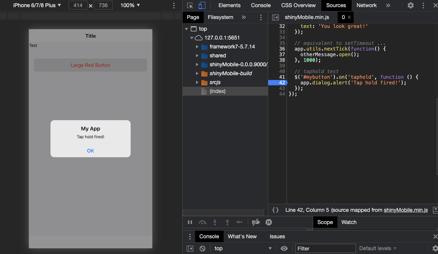
FIGURE 23.5: Long press or taphold event.
An important remark is the click handling in Framework7. Framework7 has its own internal router that allows users pass data between pages and perform quite
advanced actions. Do you remember the app.views.create('.view-main'); step? This real purpose is actually to activate the internal router. While extremely convenient for classic web apps,
this feature is not completely suited for Shiny that does not natively support multi-page apps.
The recent work in the field is promising and plays well
with shinyMobile (see here) but this is out of the scope of this chapter. The internal router has strong implications, for instance, clicking on
<a href="https://www.google.com/">Click me</a> will fail (while it works like
a charm for a classic Shiny app).
To fix this issue, Framework7 has a clicks module option, accepting any valid CSS selector.
Below is the default configuration:
clicks: {
  externalLinks: '.external',
}
Consequently, in order to skip the internal router, links must have the .external class.
### RUN ###
# OSUICode::run_example(
#  "shinyMobile/links",
#   package = "OSUICode"
# )

### APP CODE ###
library(shiny)
library(OSUICode)

my_broken_link <- a(
  href = "https://www.google.com/",
  "Broken link"
)
my_external_link <- my_broken_link
my_external_link$attribs$class <- "external"
my_external_link$children[[1]] <- "External link"

# shinyMobile
ui <- f7_page(
  allowPWA = FALSE,
  navbar = f7_navbar("Links"),
  toolbar = f7_toolbar(
    my_broken_link,
    my_external_link
  ),
  title = "shinyMobile"
)

server <- function(input, output, session) {}

shinyApp(ui, server)
One might be tempted to target all a elements: this is a bad idea,
as it also targets tabs navigation, which eventually fails. Therefore, it is best
practice to add the external class to all the necessary links like a(href = "https://www.google.com/", "Click me", class = "external")
23.6 Theming and colors
Framework7 offers fifteen color themes with a dark/light global appearance. To apply them, we add color-theme-COLOR to the
parent element. Best practice is to target the body since it is the parent of all the page
content, thereby ensuring global consistency. The dark theme is triggered by adding the
theme-dark class to html. Since body belongs to f7_page() but not html (added by
Shiny at startup), we can apply the color in R, while the dark mode has to be activated from JS:
f7_page <- function(..., navbar, toolbar,
                    title = NULL, options = NULL) {

  body_cl <- NULL
  if (!is.null(options$color)) {
    body_cl <- sprintf("color-theme-%s", options$color)
  }

  # Config tag (unchanged)

  # Modify the body tag to add a class
  tags$body(
    class = body_cl,
    # ... App wrapper (unchanged),
    config_tag
  )

  # ...

}
This approach assumes the user passing the color name as a parameter like pink, yellow and won’t be considered in the remaining of the book.
What if we want to allow more flexibility and add any existing HEX color?
Framework7 has tools, namely app.utils.colorThemeCSSProperties, that is a JS method
creating the required CSS on the fly depending on the provided HEX color. For instance, if we select a
cyberpunk green color:
app.utils.colorThemeCSSProperties('#42f5a1');
// /* Custom color theme */
// {
//   "--f7-theme-color": "#42f5a1";
//   "--f7-theme-color-rgb": "66, 245, 161";
//   "--f7-theme-color-shade": "#1bf38e";
//   "--f7-theme-color-tint": "#69f7b4";
// }
The commented code has to be injected in the app CSS. I personally don’t think it’s a problem
to look for a specific HEX code, knowing that many online tools can help. Therefore, I prefer the
second approach. We edit the init.js code by adding the following JS snippet:
if (config.hasOwnProperty('color')) {
  let colorCSS = app.utils.colorThemeCSSProperties(config.color);
  $('<style>')
    .prop('type', 'text/css')
    .html(`:root {
    --f7-theme-color:${colorCSS['--f7-theme-color']};
    --f7-theme-color-rgb:${colorCSS['--f7-theme-color-rgb']};
    --f7-theme-color-shade:${colorCSS['--f7-theme-color-shade']};
    --f7-theme-color-tint:${colorCSS['--f7-theme-color-tint']};
    }`)
    .appendTo('head');
}
config.hasOwnProperty('color') ensures that this code does not run if color is missing from the
provided config. Then, we generate an object, colorCSS, containing the theme color properties with app.utils.colorThemeCSSProperties(config.color).
Importantly, as this is an object, we can’t insert it in a string. However, we can extract its
properties 1 by 1 to generate the relevant piece of CSS, for instance colorCSS["--f7-theme-color"]. Then we add a style tag to the head
containing the CSS rule. Once done, recompile the JS
with build_js() and try with the following app.
### RUN ###
# OSUICode::run_example(
#  "shinyMobile/white-filled",
#   package = "OSUICode"
# )

### APP CODE ###
library(shiny)
library(OSUICode)

shinyMobile_options$filled <- TRUE
shinyMobile_options$dark <- FALSE

ui <- f7_page(
  allowPWA = FALSE,
  options = shinyMobile_options,
  tags$div(
    class = "block",
    tags$button(
      class = "button button-large button-fill",
      "Click"
    )
  ),
  navbar = f7_navbar("White/filled design"),
  toolbar = f7_toolbar(),
  title = "shinyMobile"
)

server <- function(input, output, session) {}

shinyApp(ui, server)
We can go further and apply the filled theme, which is an alternative design where all
navbar, toolbar, … are filled with the theme color. In that case, we add the following CSS inside init.js:
if (!config.hasOwnProperty('filled')) config.filled = false;
if (config.filled) {
  let filledCSS = `
    :root,
    :root.theme-dark,
    :root .theme-dark {
      --f7-bars-bg-color: var(--f7-theme-color);
      --f7-bars-bg-color-rgb: var(--f7-theme-color-rgb);
      --f7-bars-translucent-opacity: 0.9;
      --f7-bars-text-color: #fff;
      --f7-bars-link-color: #fff;
      --f7-navbar-subtitle-text-color: rgba(255,255,255,0.85);
      --f7-bars-border-color: transparent;
      --f7-tabbar-link-active-color: #fff;
      --f7-tabbar-link-inactive-color: rgba(255,255,255,0.54);
      --f7-sheet-border-color: transparent;
      --f7-tabbar-link-active-border-color: #fff;
    }
    .appbar,
    .navbar,
    .toolbar,
    .subnavbar,
    .calendar-header,
    .calendar-footer {
      --f7-touch-ripple-color: var(--f7-touch-ripple-white);
      --f7-link-highlight-color: var(--f7-link-highlight-white);
      --f7-button-text-color: #fff;
      --f7-button-pressed-bg-color: rgba(255,255,255,0.1);
    }
    .navbar-large-transparent,
    .navbar-large.navbar-transparent {
      --f7-navbar-large-title-text-color: #000;

      --r: 0;
      --g: 122;
      --b: 255;
      --progress: var(--f7-navbar-large-collapse-progress);
      --f7-bars-link-color: rgb(
        calc(var(--r) + (255 - var(--r)) * var(--progress)),
        calc(var(--g) + (255 - var(--g)) * var(--progress)),
        calc(var(--b) + (255 - var(--b)) * var(--progress))
      );
    }
    .theme-dark .navbar-large-transparent,
    .theme-dark .navbar-large.navbar-transparent {
      --f7-navbar-large-title-text-color: #fff;
  }`;

  $('<style>')
    .prop('type', 'text/css')
    .html(`${filledCSS}`)
    .appendTo('head');
}
The result is displayed in Figure 23.6. Don’t forget to set filled = TRUE in shinyMobile_options.
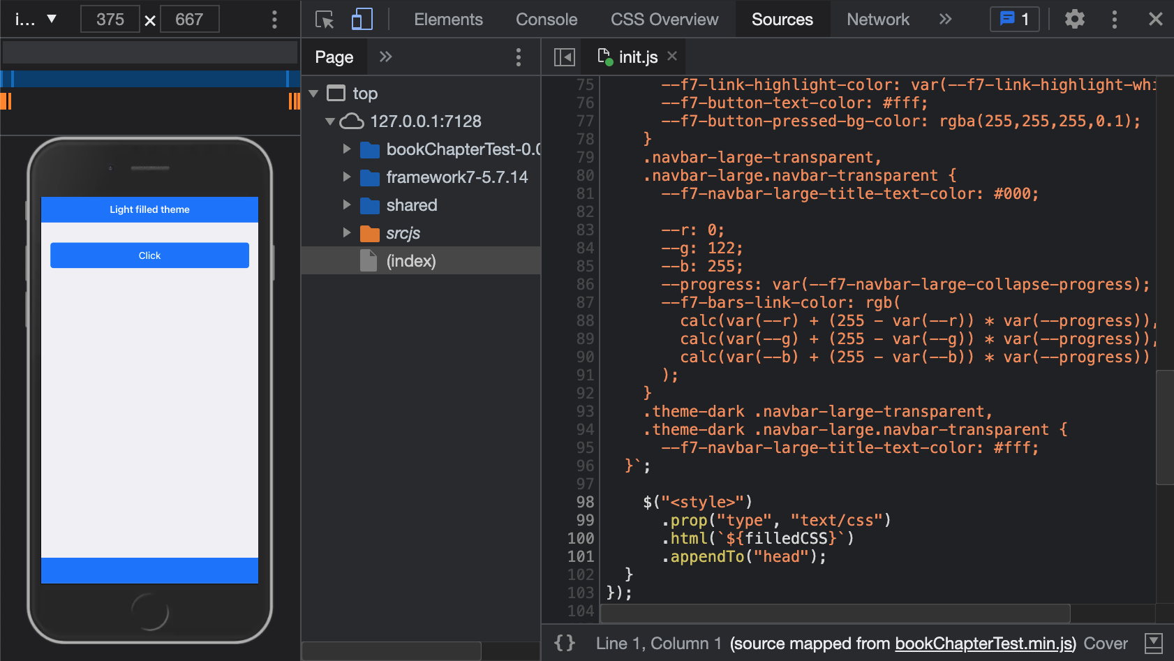
FIGURE 23.6: Filled blue color theme.
Let’s finish this section with the dark mode. We leverage the Framework7 app method
element since we could also toggle the dark mode under other circumstances. We add a
toggleDarkTheme function to the methods object then trigger it depending on the value
of the config. If the user doesn’t provide any value, we set config.dark to false. We insert it right before app = new Framework7(config); inside init.js:
// ... get config
config.methods = {
  toggleDarkTheme: function () {
    let self = this;
    let $html = self.$('html');
    $html.toggleClass('theme-dark');
  }
};

if (!config.hasOwnProperty('dark')) config.dark = false;

app = new Framework7(config);

if (config.dark) {
  app.methods.toggleDarkTheme();
}

// ... other code
At this point init.js is given in appendix A.2.1.
### RUN ###
# OSUICode::run_example(
#  "shinyMobile/dark-filled",
#   package = "OSUICode"
# )

### APP CODE ###
library(shiny)
library(OSUICode)

shinyMobile_options$filled <- TRUE

ui <- f7_page(
  allowPWA = FALSE,
  options = shinyMobile_options,
  tags$div(
    class = "block",
    tags$button(
      class = "button button-large button-fill",
      "Click"
    )
  ),
  navbar = f7_navbar("Dark/filled design"),
  toolbar = f7_toolbar(),
  title = "shinyMobile"
)

server <- function(input, output, session) {}

shinyApp(ui, server)
The overall expected result is shown Figure 23.7.
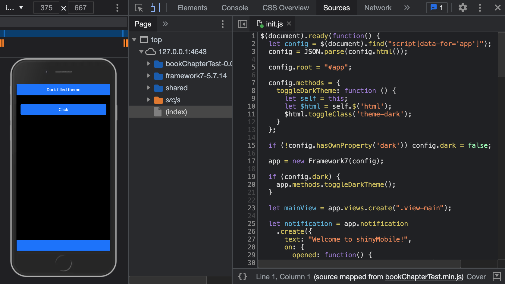
FIGURE 23.7: Dark mode in {shinyMobile}.
23.7 Modularize JS code
As shown above, the init.js code starts to grow and this is not a good sign.
In this section, we show how to utilize the import and export statements, possible
owing to the esbuild JS bundler. Note that this is a more modern version of writing equivalent to the module.exports and require shown in section 10.4.6.1.
In the R console, we run create_js("helpers_config", add_reference = FALSE), which creates a new JS script but does not import it in the main.js esbuild entry point. Inside we extract a function containing all steps to set up the app configuration object:
export const setConfig = () => {
  // collect all data elements stored in body
  let config = $(document).find('script[data-for="app"]');
  config = JSON.parse(config.html());

  // always erase existing root value just in case the user
  // changes the root. This may be harmful
  config.root = '#app';

  // store app methods
  config.methods =  {
    toggleDarkTheme: function() {
      let self = this;
      let $html = self.$('html');
      $html.toggleClass('theme-dark');
    }
  };

  // App data
  config.data = function() {
    return {
      // any interesting element to save
    };
  };

  return config;
};
This function does not have any argument and must return the config variable that will be subsequently injected in new Framework7(config) to initialize the app. In the init.js script, we import the setConfig() function and call it within $( document ).ready:
import { setConfig } from './helpers_config.js';

$( document ).ready(function() {
  let config = setConfig();
  // create app instance
  app = new Framework7(config);
  // ...
});
We finally bundle our code with build_js().
If the function has a side effect, for instance modifying a variable located in another scope, it must return the transformed variable output, so that it can be tracked at the upper level.
We have now set all foundations. In the next chapter, we see how to convert a shinyMobile app (and any vanilla shiny app) into a progressive web app (PWA).
23.8 Exercise
Continue to improve the JS code by adding an extra helper consisting of all related theme and layout features.
- Run
create_js("helpers_theme", add_reference = FALSE). - Add to it a
setTouchStylefunction (copy and paste code from section 23.5.7):
const setTouchStyle = (config) => {
  if (config.hasOwnProperty('touch')) {
    if (config.touch.tapHold) {
      // touch logic
    }
  }
};- Add a
setColorThemefunction (copy and paste code from section 23.6):
const setColorTheme = (config, app) => {
  if (config.hasOwnProperty('color')) {
    // logic
  }
};- Add a
setFilledThemefunction (copy and paste code from section 23.6):
const setFilledTheme = (config) => {
  if (!config.hasOwnProperty('filled')) config.filled = false;
  if (config.filled) {
    // logic
  }
};- Add the
setDarkModefunction:
const setDarkMode = (config, app) => {
  if (!config.hasOwnProperty('dark')) config.dark = false;
  if (config.dark) {
    app.methods.toggleDarkTheme();
  }
};- Finish by exporting the
initThemefunction, that calls all previously defined helpers:
export const initTheme = (config, app) => {
  setTouchStyle(config);
  setColorTheme(config, app);
  setFilledTheme(config);
  setDarkMode(config, app);
};- Move it to the
init.jsscript and import thehelpers_theme.js.
import { initTheme } from './helpers_theme.js'-
initThemehas to be called after app instantiation. You should obtain something like below. Once done, rebuild the JS code withbuild_js()and test with an app example.
import { setConfig } from './helpers_config.js';
import { initTheme } from './helpers_theme.js'

$( document ).ready(function() {
  let config = setConfig();
  // create app instance
  app = new Framework7(config);

  // Set theme: dark mode, touch, filled, color, taphold css
  initTheme(config, app);
  // ...
});