27 Shiny and React with {reactR}
React is an open-source library designed to quickly develop user interfaces or UI components, on the front end. It has been developed by Facebook and the community (more than 1500 contributors) and made public in May 2013. It is currently used worldwide and has around 163 k stars on the GitHub ranking and widely impacts the mobile market, through the React Native library. React is also really convenient to develop attractive documentations with docusaurus. If you ever have built user interfaces with pure JS, you might like React!
Below, we give a short introduction to the React ecosystem and see how we can benefit from it from the R Shiny side. By the end of this chapter, you’ll be able to develop R interfaces to some nice React libraries like the Argon design system, shown Figure 27.1.
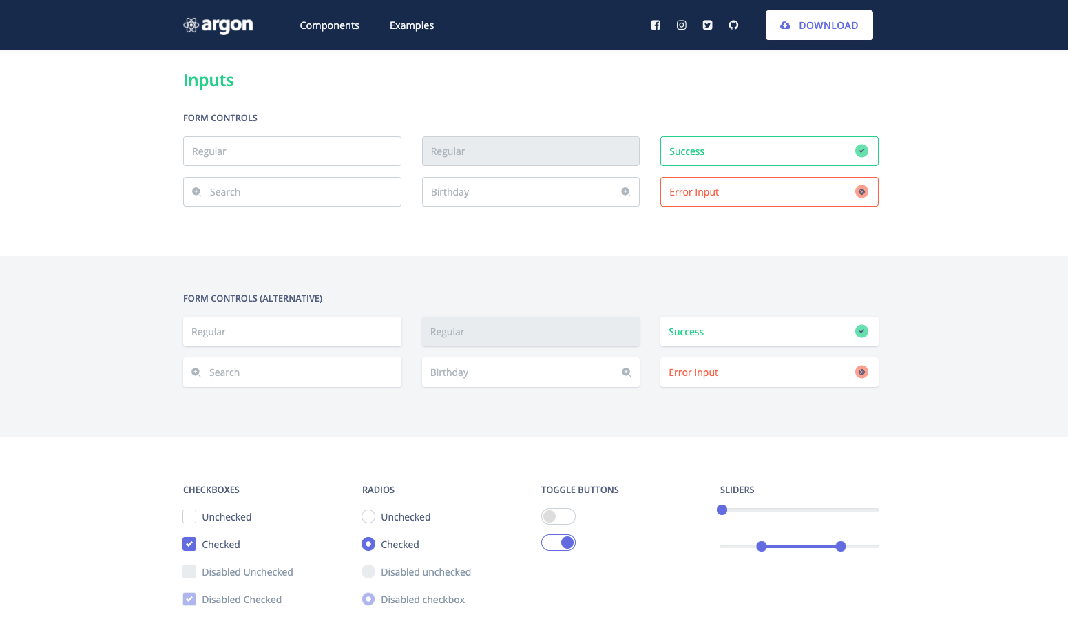
FIGURE 27.1: Argon design template with React.
As another example, {reactable} is an HTML widget developed on top of the react-table library.
27.1 Quick introduction to React
To understand React, there are few prerequisites, notably basic HTML/CSS/JS knowledge, especially JS modules (see section 10.4.6.1). However, if you managed to reach this chapter, you should not worry too much.
27.1.1 Setup
Node and npm are required. If you are not sure, run:
node -v
npm -v
At that stage it is also good to have yarn, as we’ll need it for reactR.
If nothing is returned, please refer to section 10.3.1. To initiate a React project, we leverage the npx command:
npx create-react-app <PROJECT_NAME>Replace <PROJECT_NAME> by the real name of your project. If this seems intimidating,
keep in mind this is the same concept that the golem package uses to initiate the creation of robust Shiny projects, except that we work from the terminal.
Once done (the package initialization takes some time), move to the project folder and launch the demo app:
cd <PROJECT_NAME> && npm startIf you have yarn, yarn start also works.
You should see something similar to Figure 27.2.
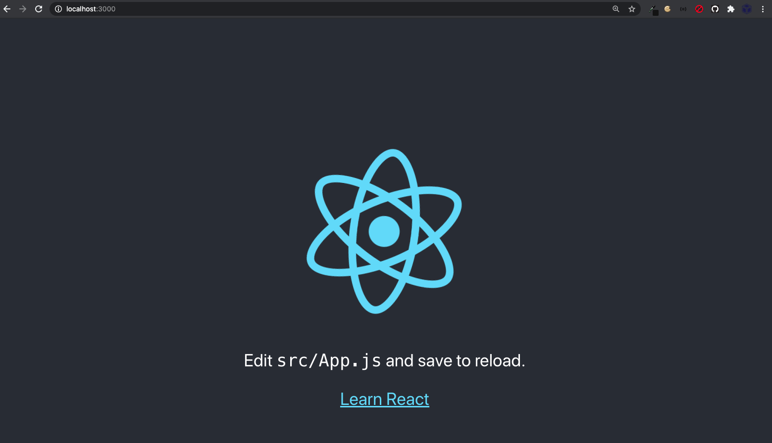
FIGURE 27.2: npm start opens the React app.
Congrats! You are running your first React app.
27.1.2 Basics
We are now all set up to start learning the basics of React. Among all created files,
notice the /src/app.js file. Inside the App function, we remove all the content inside
the return statement to put a simple <h1>Hello, world!</h1> HTML title. We also clean the imports
as we don’t need any CSS and logo anymore. We obtain:
function App() {
  return (
    <h1>Hello, world!</h1>
  );
}

// don't remove, this is needed by index.js
export default App;
Once done, we run npm build (or yarn build), to rebuild the JS code and npm start to
restart the server and preview the app. In practice, once the server is launched, there is
no need to restart it whenever the code is updated. A simple save will refresh the interface!
The code you see above is a React component. The definition is rather simple: it is a function that returns a rather complex piece of UI. How are components rendered by React?
So far, we didn’t have a look at the /src/index.js script. Inside we find:
ReactDOM.render(
  App,
  document.getElementById('root')
);
Recent versions of npx create-react-app have <React.StrictMode><App /></React.StrictMode> instead of App, which does the same thing. You may also find <App />. In practice, we rarely modify this part.
In short, this inserts the App component inside the element having root as id in the main
HTML page. This HTML skeleton may be found in the public/index.html folder. You may imagine that at the end of the day, our app will be composed of multiple bricks and call ReactDOM.render on the top-level component.
27.1.2.1 About JSX
We just wrote our first React component. Didn’t you notice something weird in that code? JS and HTML are mixed, in what we called JSX, that is a syntax extension to JS. JSX makes the code less verbose, for instance:
React.createElement(
  'h1',
  'Hello, world!'
);
does exactly the same thing as above but when the code becomes more complex, it is nearly impossible to read.
Let’s see how to pass variables into JSX. We want to show Hello, <Your Name>, we store
the name in a variable and modify the app.js code accordingly:
function App() {
  const name = 'David';
  return (
    <h1>Hello, {name}</h1>
  );
}
Expressions are passed within curly brackets {expression} and you may even call functions inside.
Tag attributes also require curly brackets. Let’s modify the title tag to give it a color and
a size.
function App() {
  const name = 'David';
  return (
    <h1 style={color: 'red', fontSize: 40}>Hello, {name}</h1>
  );
}
Try to save. Why does this fail? We can’t pass multiple object properties inside a single {}.
We need either double brackets like {{object properties: values, ...}} or to store the object in
a variable before:
function App() {
  const name = 'David';
  return (
    <h1 style={{color: 'red', fontSize: 40}}>Hello, {name}</h1>
  );
}

// OR

function App() {
  const name = 'David';
  const myStyle = {
    color: 'red',
    fontSize: 40
  }
  return (
    <h1 style={myStyle}>Hello, {name}</h1>
  );
}
Notice that we write CSS properties following the camelCase syntax, font-size being equivalent to fontSize.
27.1.2.2 Combining components
The whole interest is to combine multiple components to create reusable pieces. We edit the above code
to create a SayHello component. Notice the props parameter. It is a way to pass configuration from the parent component. In that case, we want to display the person name, that is props.name. In the meantime, we edit the App parent component and call SayHello three times, passing a different name like <SayHello name="David" /> (this is the reason why we recover props.name in the lower-level component):
function SayHello(props) {
  return (
    <h1>Hello, {props.name}</h1>
  );
}


function App() {
  return(
  <>
    <SayHello name="David" />
    <SayHello name="Lisa" />
    <SayHello name="Simon" />
  </>
  );
}
Notice the enclosing <>...</>. This is called a React fragment and useful if we don’t want to
insert any extra <div> in the DOM.
We could be even more efficient by leveraging the lists capabilities. We create an array
of names and apply the map method to return the corresponding <SayHello /> sub-component:
const names = ['David', 'Lisa', 'Simon'];
function App() {
  const sayHelloToAll = names.map(
    (name) => <SayHello key={name} name={name} />
  );
  return(sayHelloToAll);
}
By convention, all elements inside a map require keys.
Props are read-only and must not be modified within their own component. How do we update components then?
27.1.2.3 Component state
A component state is private and controlled by this same component. Since React 16.8 and the introduction of hooks, this is not necessary to convert the component function to a class.
The easiest example to illustrate hooks capabilities is the button. Each time, we click on a button,
we want to keep the current number of clicks in a state, like the actionButton(). We start by
importing the useState function from react and create a new ActionButton component.
Inside, we set the state with useState, which creates the state variable count, as well as the function to update it, namely setCount. This way to create two variables at once is called array destructuring. We set the initial number of counts to 0:
import {useState} from 'react';

function ActionButton() {
  const [count, setCount] = useState(0);
}
Next step is to create the button skeleton. We provide an onClick property that updates
the button state. Inside, we write an anonymous function, which calls setCount and increments
the count value by 1. At this point, you may replace the app.js content by:
import {useState} from 'react';

function ActionButton() {
  const [count, setCount] = useState(0);
  return(
    <button onClick={() => setCount(count + 1)}>
      Number of clicks: {count}
    </button >
  );
}

function App() {
  return (
    <ActionButton />
  );
}

export default App;
We may improve the previous app and add a reset button within the ActionButton component that
sets the count back to 0:
function ActionButton() {
  const [count, setCount] = useState(0);
  return(
    <>
    <button onClick={() => setCount(count + 1)}>
      Number of clicks: {count}
    </button >
    <button onClick={() => setCount(0)}>
      Reset
    </button >
    </>
  );
}
It would make more sense to only show the reset button once the button has been clicked at least once. We define the isResetVisible variable which is true whenever the
count is higher than 0 and false if the count is 0, leveraging the JS ternary operator. We store the reset button in a variable and only return something if isResetVisible is true:
function ActionButton() {
  const [count, setCount] = useState(0);
  const isResetVisible = count > 0 ? true : false;
  let resetButton;
  if (isResetVisible) {
    resetButton = <button onClick={() => setCount(0)}>
      Reset
    </button >
  }
  return (
    <>
      <button onClick={() => setCount(count + 1)}>
        Number of clicks: {count}
      </button >
      {resetButton}
    </>
  );
}
That’s all folks! Now that you get a better understanding of how React works, let’s see how to use it with Shiny.
27.2 Introduction to {reactR}
This section has been written and tested with reactR 0.4.4.
Some features may change in future releases.
In this part, we see how to leverage reactR (Inc et al. 2021) to bring a few component from the reactstrap library to Shiny.
To install reactR:
# stable from CRAN
install.packages("reactR")

# lastest from GitHub
remotes::install_github("react-R/reactR")
In the following, we are going to propose an implementation of the reactstrap button, which is a Bootstrap 4 and React-powered action button.
27.2.1 Setup
reactR exposes the scaffoldReactShinyInput(), which sets the necessary pieces of code to get started with the input development (see Figure 27.3):
- An
<input_name>.Rfile containing the input skeleton as well as its related update function, located in the./Rfolder. It also creates a custom HTML dependency pointing to the input JS logic. - A
jsxfile with a boilerplate to start developing the input JS logic, located in the./srcjsfolder. - A
package.jsonfile containing dependencies. - An
app.Rfile to host the input demonstration code. - A
webpack.config.jsfile (discussed later). - Classic R package files like
DESCRIPTION,.Rbuildignore… Interestingly, the.Rbuildignorecontains a few lines to ignore non-standard files and folders likesrcjsandpackage.json.
Besides, providing an optional dependency with a name and version taken from npm installs all necessary dependencies in the package.json file:
path <- file.path(tempdir(), "reactstrapTest")
usethis::create_package(path, rstudio = TRUE)

# Wait new project to be created before running
# the following!!!
reactR::scaffoldReactShinyInput(
  "action_button",
  list(
    "reactstrap" = "^8.9.0"
  )
)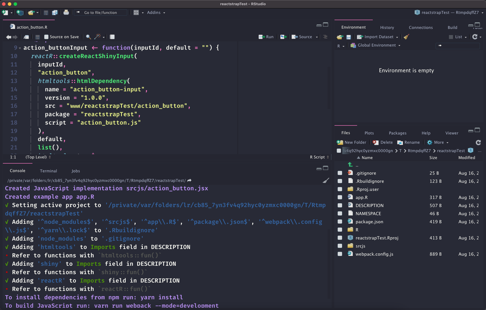
FIGURE 27.3: Package initialization with {reactR}.
Note that reactR provides webpack as JS code manager. To build the JS code, we go to the RStudio terminal tab (or any terminal) and run at the package root:
yarn install
yarn run webpack --mode=development
This installs all dependencies listed in the package.json file and creates a package-lock.json file. If you ever used renv, this is very similar and guarantees isolation of your package. All dependencies are stored in the node_modules folder.
The run webpack command compiles the JS in production-ready code. Should you need to customize the build pipeline, the webpack configuration is located in webpack.config.js. On the R side, the generated JS file is referenced in HTML dependencies, located in the <input_name>.R file.
If you specify the --mode=development tag, it falls back to development code.
In the following, we see how to customize the newly created component.
27.2.2 Customize the R logic
A reactR input is composed of R and JS code that both exchange information. Upon initialization, we obtained a .R/action_button.R code:
action_buttonInput <- function(inputId, default = "") {
  reactR::createReactShinyInput(
    inputId,
    "action_button",
    htmltools::htmlDependency(
      name = "action_button-input",
      version = "1.0.0",
      src = "www/reactstrapTest/action_button",
      package = "reactstrapTest",
      script = "action_button.js"
    ),
    default,
    list(),
    htmltools::tags$span
  )
}
For convenience, we remove the input suffix to name it action_button.
Overall, this function calls reactR::createReactShinyInput() that:
- Gives the widget a class and id. The class is targeted on the JS side (see 27.2.3) and is necessary to make it working.
- Sets all necessary dependencies (React, …), as well as the internal JS code (see section 27.2.3).
- Creates the input HTML code with htmltools.
- Sets the default value, through the
defaultparameter. - Allows passing a list of options inside the
list()container. By default, nothing is sent but we will use it very soon.
We also have the corresponding update input function, which we renamed to update_action_button() for consistency:
update_action_button <- function(session, inputId, value,
                                 configuration = NULL) {
  message <- list(value = value)
  if (!is.null(configuration)) {
    message$configuration <- configuration
  }
  session$sendInputMessage(inputId, message);
}
In Shiny, the end user cannot decide what is the initial value of an action button. It is always set to 0 by default. Therefore, we decided to remove the default parameter from action_button() and make it 0 by default.
In order to add a label and change the button color, we introduce two extra parameters and
add them to the configuration list:
action_button <- function(
  inputId,
  label,
  status = "primary"
) {
  reactR::createReactShinyInput(
    # ... unchanged ...
    default = 0,
    configuration = list(
      label = label,
      status = status
    ),
    htmltools::tags$div
  )
}
Let’s see below how to make this interactive with some JSX code.
27.2.3 Implement the JS logic
It’s time to develop the logic. For now, the action_button.jsx file only contains a placeholder generated by reactR. The reactstrap documentation provides a boilerplate, which we slightly modified, according to the reactR documentation:
import { reactShinyInput } from 'reactR';
import { Button } from 'reactstrap';

function ActionButton() {
  return (
    <Button
      color="primary">
    </Button>
  );
}

reactShinyInput(
  '.action_button',
  'reactstrapTest.action_button',
  ActionButton
);
As you can see, we need to import the Button component from reactstrap as well as
the reactShinyInput function from the reactR package. To generate our JS code, we recompile with yarn run webpack, document and reload the package functions:
devtools::document()
devtools::load_all()
In the ./app.R script, we have to tell Shiny we want to use Bootstrap 4 instead of Bootstrap 3, through the bslib::bs_theme function. Erase the existing code and replace it by the following:
### RUN ###
# OSUICode::run_example(
#  "demo-button",
#   package = "reactstrapTest"
# )

### APP CODE ###
library(shiny)
library(reactstrapTest)

ui <- fluidPage(
  theme = bslib::bs_theme(version = "4"),
  action_button("plop", "Click me!")
)

server <- function(input, output, session) {
  observe(print(input$plop))
}

shinyApp(ui, server)
As you can see Figure 27.4, the button label is not displayed nor its value.
This is because we missed to leverage the component arguments that are configuration, value, setValue, making the link between R and JS.
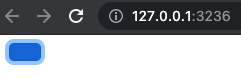
FIGURE 27.4: Work-in-progress action button with React.
27.2.4 Improve the JS logic
We modify the action_button.jsx code to add those three parameters to the ActionButton component:
function ActionButton({ configuration, value, setValue }) {
  return (
    <Button
      color={configuration.status}
      onClick={() => setValue(value + 1)}>
      {configuration.label}
    </Button>
  );
}
Remember that configuration is an R list and sent to JS as a JSON object with reactR::createReactShinyInput(). On the JS side, we access its properties with configuration.<PROPERTY>. value is the current button value, which is 0 when the app is started.
How do we update the button value upon click? Well, this is pretty straightforward. The Button element has an onClick property inside which we can pass the setValue function and increment it by 1 (setValue is an internal hook, see section 27.1.2.3).
In the below example, we update a button from the server side with update_action_button():
### RUN ###
# OSUICode::run_example(
#  "demo-update-button",
#   package = "reactstrapTest"
# )

### APP CODE ###
library(shiny)
library(reactstrapTest)

ui <- fluidPage(
  theme = bslib::bs_theme(version = "4"),
  fluidRow(
    action_button("plop", "Click me!"),
    action_button("update", "Update button 1")
  )
)

server <- function(input, output, session) {
  observe(print(input$plop))
  observeEvent(input$update, {
    update_action_button(
      session, "plop",
      configuration = list(
        label = "New text",
        status = "success"
      )
    )
  }, ignoreInit = TRUE)
}

shinyApp(ui, server)
Clicking on the first button should increment its value in the R console. You may play around by changing the default color. After clicking on the second button, you should get the result shown Figure 27.5.
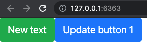
FIGURE 27.5: Fully working React-powered action button.
27.2.5 Exercise 1
Based on the previous example and the reactstrap documentation, improve the action button component:
- Add it a
sizestyle parameter. - Add it a
disabledparameter. - Add it an
outlinestyle parameter.
27.2.6 Technical considerations
Under the hood, the JS reactShinyInput function provides a wrapper to automatically bind the input element. This is convenient as it allows you to solely focus on the component logic rather than binding it to the shiny system. It takes three parameters:
- The element class, which is obtained from the R side by
createReactShinyInput(). - The input binding name, which is useful to storing a reference in the
Shiny.InputBindingsregistry. Recent versions of reactR use<PACKAGE_NAME>.<INPUT_NAME>as convention, which avoids conflicts between inputs belonging to two different packages. - The React component function.
- There is an optional fourth parameter allowing you to pass custom options like rate policies.
Overall, reactShinyInput extends the Shiny.InputBinding class by providing extra methods like:
getInputConfiguration(el) {
  return $(el).data('configuration');
}
setInputConfiguration(el, configuration) {
  $(el).data('configuration', configuration);
}
getInputConfiguration and setInputConfiguration, respectively, get and set the user-provided configuration, passed in the createReactShinyInput() R side function. Under the hood (in addition to the reactR, React, ReactTools HTML dependencies and any user-defined custom dependencies), createReactShinyInput() generates three tag elements:
- The first tag is the element placeholder containing the unique id. React will insert
the component inside this target with
ReactDOM.render. - The second tag is a script containing the value passed as JSON.
- The second tag is a script containing the configuration, also passed as JSON.
library(shiny)
reactR::createReactShinyInput(
  inputId = "plop",
  class = "myinput",
  dependencies = htmltools::findDependencies(icon("bicycle")),
  default = 0,
  configuration = list(a = 1, b = "test"),
  container = div
)
#> <div id="plop" class="myinput"></div>
#> <script id="plop_value" type="application/json">0</script>
#> <script
#> id="plop_configuration"
#> type="application/json">{"a":1,"b":"test"}
#> </script>The configuration and values are processed in the initialize method since it is called before the input is bound:
// Within reactR's initialize method...
$(el).data('value', JSON.parse($(el).next().text()));
$(el).data(
  'configuration',
  JSON.parse($(el).next().next().text())
);
The configuration and values are stored in the corresponding data attributes. The most important part is the render method, which creates the React element based upon its configuration and value and renders it in the DOM:
// reactR's render method
render(el) {
  const element = React.createElement(component, {
    configuration: this.getInputConfiguration(el),
    value: this.getValue(el),
    setValue: this.setValue.bind(this, el),
    el: el
  });
  ReactDOM.render(element, el);
}
The render method is called once inside subscribe and also each time the element is updated
with receiveMessage.
27.2.7 Exercise 2
- Add an
icon(from Font Awesome) parameter to theActionButtoncomponent. Hint: You might find it helpful to capture its HTML dependency withhtmltools::findDependencies(iconTag)so as to properly render it. In HTMLicon("bicycle")produces<i class="fa fa-bicycle" role="presentation" aria-label="bicycle icon"></i>. However, in React we want<i className="fa fa-bicycle />. Therefore, you will have to extract the icon class and send it to JS in the configuration list. - Implement the logic on the JS side. Hint: you may use the code in appendix A.3.1.1.
- Try your code inside a Shiny app.
27.2.8 Add another input
27.2.8.1 Button group input
In this section, we design a radio input consisting of multiple buttons displayed side by side. The corresponding widget has a label and must show the currently selected value.
We initialized the input elements with:
reactR::scaffoldReactShinyInput("button_group")As shown previously, this creates ./srcjs/button_group.jsx and .R/button_group.R.
The button_group() function has four parameters, the most critical being choices.
We expect the user to pass a vector like names(mtcars), and we selected the first choice by default. We might add a selected parameter but leave this for the reader as a simple exercise. The function is defined below:
button_group <- function(
  inputId,
  label,
  choices,
  status = "primary"
) {
  reactR::createReactShinyInput(
    inputId,
    "button_group",
    htmltools::htmlDependency(
      name = "button_group-input",
      version = "1.0.0",
      src = "www/reactstrapTest",
      package = "reactstrapTest",
      script = "button_group.js"
    ),
    default = choices[1],
    configuration = list(
      label = label,
      choices = choices,
      status = status
    ),
    htmltools::tags$div
  )
}
The expected reactstrap button group HTML structure is rather simple including a title, the list of button tags and the selected item in a paragraph:
<div>
  <h5>Radio Buttons</h5>
  <ButtonGroup>
    <Button
      color="primary"
      onClick={...}
      active={value === 1}>
      One
    </Button>
    <Button
      color="primary"
      onClick={...}
      active={value === 2}>
      Two
    </Button>
    // ... other buttons ...
  </ButtonGroup>
  <p>Selected: {value}</p>
</div>
Inside ./srcjs/button_group.jsx, we first import the required function and components:
import { reactShinyInput } from 'reactR';
import { Button, ButtonGroup } from 'reactstrap';
We then design the ButtonGroupUI JS function that will return our component. The critical step is to recover the user choices (configuration.choices) and store them in a variable. Then, we leverage the map feature (see section 27.1.2.2) to iterate over each choice and programmatically create all buttons:
function ButtonGroupUI({ configuration, value, setValue }) {
  const choices = configuration.choices
  // programmatically create buttons
  const buttons = choices.map(
    (choice) => <Button
      key={choice}
      color={configuration.status}
      onClick={() => setValue(choice)}
      active={value === choice}>
        {choice}
      </Button>
  )
  // ... other code
We finally return the whole component in a fragment <> to prevent creating extra div. The whole code is shown below:
import { reactShinyInput } from 'reactR';
import { Button, ButtonGroup } from 'reactstrap';

function ButtonGroupUI({ configuration, value, setValue }) {

  // ... create buttons ... //

  return (
    <>
      <h5>{configuration.label}</h5>
      <ButtonGroup>
       {buttons}
      </ButtonGroup>
      <p>Selected: {value}</p>
    </>
  );
}
Now, we may test the newly created element in a Shiny app:
### RUN ###
# OSUICode::run_example(
#  "demo-button-group",
#   package = "reactstrapTest"
# )

### APP CODE ###
library(shiny)
library(reactstrapTest)

ui <- fluidPage(
  theme = bslib::bs_theme(version = "4"),
  button_group(
    "plop",
    "A group of buttons",
    choices = names(mtcars)
  )
)

server <- function(input, output, session) {
  observe(print(input$plop))
}

shinyApp(ui, server)
According to Figure 27.6, there are rooms for improvements, but it is a good start!
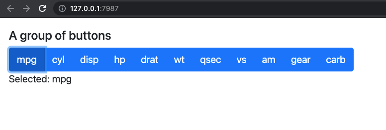
FIGURE 27.6: Fully working React powered button group (similar to the Shiny radio input).
27.2.8.2 Modularize JS code
Imagine if we had to repeat this for ten different elements. As we start to accumulate components, it is good practice to start modularizing our code. Inside the ./srcjs/action_button.jsx, we wrap the reactShinyInput call into an export statement:
// To add in ./srcjs/action_button.jsx
export default function initActionButton(){
  reactShinyInput(
    '.action_button',
    'reactstrapTest.action_button',
    ActionButton
  );
}
We apply the same strategy in the ./srcjs/button_group.jsx script:
// To add in `./srcjs/button_group.jsx`
export default function initButtonGroup(){
  reactShinyInput(
    '.button_group',
    'reactstrapTest.button_group',
    ButtonGroupUI
  );
}
We create a main.jsx file containing the necessary code to import and initialize our two components:
import initActionButton from './action_button.jsx';
import initButtonGroup from './button_group.jsx';

initActionButton();
initButtonGroup();
We have to modify the webpack.config.js to change the entry point to main.jsx, whose output will be main.js:
entry: [
  path.join(__dirname, 'srcjs', 'main.jsx')
],
output: {
  path: path.join(__dirname, 'inst/www/reactstrapTest'),
  filename: 'main.js'
}
This means we have to update the HTML dependency on the R side, for instance in the button_group.R, we replace the existing dependency by the following:
# ... button_group.R start
# ...
  htmltools::htmlDependency(
    name = "button_group-input",
    version = "1.0.0",
    src = "www/reactstrapTest",
    package = "reactstrapTest",
    script = "main.js"
  )
# ...
# button_group.R end
We proceed similarly in the action_button.R script.
27.3 Further resources
shiny.fluent (Rogala and Zyla 2021) leverages {shiny.react} (Zyla and Rogala 2021), which is another alternative to bring React to Shiny.